 by
by The article provides detailed guidance on how to use conditional formatting Icon Sets in Excel. It will teach you how to create a custom icon set that overcomes many limitations of the inbuilt options and apply icons based on another cell value.
A while ago, we started to explorer various features and capabilities of Conditional Formatting in Excel. If you haven't got a chance to read that introductory article, you may want to do this now. If you already know the basics, let's move on and see what options you have with regard to Excel's icon sets and how you can leverage them in your projects.
Excel icon sets
Icon Sets in Excel are ready-to-use formatting options that add various icons to cells, such as arrows, shapes, check marks, flags, rating starts, etc. to visually show how cell values in a range are compared to each other.
Normally, an icon set contains from three to five icons, consequently the cell values in a formatted range are divided into three to five groups from high to low. For instance, a 3-icon set uses one icon for values greater than or equal to 67%, another icon for values between 67% and 33%, and yet another icon for values lower than 33%. However, you are free to change this default behavior and define your own criteria.
![]()
How to use icon sets in Excel
To apply an icon set to your data, this is what you need to do:
- Select the range of cells you want to format.
- On the Home tab, in the Styles group, click Conditional Formatting.
- Point to Icon Sets, and then click the icon type you want.
That's it! The icons will appear inside the selected cells straight away.
![]()
How to customize Excel icon sets
If you are not happy with the way Excel has interpreted and highlighted your data, you can easily customize the applied icon set. To make edits, follow these steps:
- Select any cell conditionally formatted with the icon set.
- On the Home tab, click Conditional Formatting > Manage Rules.
- Select the rule of interest and click Edit Rule.

- In the Edit Formatting Rule dialog box, you can choose other icons and assign them to different values. To select another icon, click on the drop-down button and you will see a list of all icons available for conditional formatting.

- When done editing, click OK twice to save the changes and return to Excel.
For our example, we've chosen the red cross to highlight values greater than or equal to 50% and the green tick mark to highlight values less than 20%. For in-between values, the yellow exclamation mark will be used.
![]()
Tips:
- To reverse icon setting, click the Reverse Icon Order button.
- To hide cell values and show only icons, select the Show Icon Only check box.
- To define the criteria based on another cell value, enter the cell's address in the Value box.
- You can use icon sets together with other conditional formats, e.g. to change the background color of the cells containing icons.
How to create a custom icon set in Excel
In Microsoft Excel, there are 4 different kinds of icon sets: directional, shapes, indicators and ratings. When creating your own rule, you can use any icon from any set and assign any value to it.
To create your own custom icon set, follow these steps:
- Select the range of cells where you want to apply the icons.
- Click Conditional Formatting > Icon Sets > More Rules.
- In the New Formatting Rule dialog box, select the desired icons. From the Type dropdown box, select Percentage, Number of Formula, and type the corresponding values in the Value boxes.
- Finally, click OK.
For this example, we've created a custom three-flags icon set, where:
- Green flag marks household spendings greater than or equal to $100.
- Yellow flag is assigned to numbers less than $100 and greater than or equal to $30.
- Green flag is used for values less than $30.
How to set conditions based on another cell value
Instead of "hardcoding" the criteria in a rule, you can input each condition in a separate cell, and then refer to those cells. The key benefit of this approach is that you can easily modify the conditions by changing the values in the referenced cells without editing the rule.
For example, we've entered the two main conditions in cells G2 and G3 and configured the rule in this way:
- For Type, pick Formula.
- For the Value box, enter the cell address preceded with the equality sign. To get it done automatically by Excel, just place the cursor in the box and click the cell on the sheet.

Excel conditional formatting icon sets formula
To have the conditions calculated automatically by Excel, you can express them using a formula.
To apply conditional formatting with formula-driven icons, start creating a custom icon set as described above. In the New Formatting Rule dialog box, from the Type dropdown box, select Formula, and insert your formula in the Value box.
For this example, the following formulas are used:
- Green flag is assigned to numbers greater than or equal to an average + 10:
=AVERAGE($B$2:$B$13)+10 - Yellow flag is assigned to numbers less than an average + 10 and greater than or equal to an average - 20.
=AVERAGE($B$2:$B$13)-20 - Green flag is used for values lower than an average - 20.
Note. It's not possible to use relative references in icon set formulas.
Excel conditional format icon set to compare 2 columns
When comparing two columns, conditional formatting icon sets, such as colored arrows, can give you an excellent visual representation of the comparison. This can be done by using an icon set in combination with a formula that calculates the difference between the values in two columns - the percent change formula works nicely for this purpose.
Suppose you have the June and July spendings in columns B and C, respectively. To calculate how much the amount has changed between the two months, the formula in D2 copied down is:
=C2/B2 - 1
![]()
Now, we want to display:
- An up arrow if the percent change is a positive number (value in column C is greater than in column B).
- A down arrow if the difference is a negative number (value in column C is less than in column B).
- A horizontal arrow if the percent change is zero (columns B and C are equal).
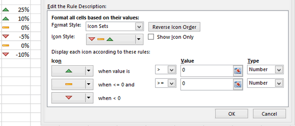
To accomplish this, you create a custom icon set rule with these settings:
- A green up arrow when Value is > 0.
- A yellow right arrow when Value is <=0 and >=0, which limits the choice to zeros.
- A red down arrow when Value is < 0.
- For all the icons, Type is set to Number.
At this point, the result will look something like this:
![]()
To show only the icons without percentages, tick the Show Icon Only checkbox.
![]()
How to apply Excel icon sets based on another cell
A common opinion is that Excel conditional formatting icon sets can only be used to format cells based on their own values. Technically, that is true. However, you can emulate the conditional format icon set based on a value in another cell.
Suppose you have payment dates in column D. Your goal is to place a green flag in column A when a certain bill is paid, i.e. there is a date in the corresponding cell in column D. If a cell in column D is blank, a red flag should be inserted.
To accomplish the task, these are the steps to perform:
- Start with adding the below formula to A2, and then copy it down the column:
=IF($D2<>"", 3, 1)The formula says to return 3 if D2 is not empty, otherwise 1.

- Select the data cells in column A without the column header (A2:A13) and create a custom icon set rule.
- Configure the following settings:
- Green flag when the number is >=3.
- Yellow flag when the number is >2. As you remember, we do not really want a yellow flag anywhere, so we set a condition that will never be satisfied, i.e. a value less than 3 and greater than 2.
- In the Type dropdown box, pick Number for both icons.
- Select the Icon Set Only checkbox to hide the numbers and only show the icons.
The result is exactly as we were looking for: the green flag if a cell in column D contains anything in it and the red flag if the cell is empty.
![]()
Excel conditional formatting icon sets based on text
By default, Excel icon sets are designed for formatting numbers, not text. But with just a little creativity, you can assign different icons to specific text values, so you can see at a glance what text is in this or that cell.
Suppose you've added the Note column to your household spendings table and want to apply certain icons based on the text labels in that column. The task requires some preparatory work such as:
- Make a summary table (F2:G4) numbering each note. The idea is to use a positive, negative, and zero number here.
- Add one more column to the original table named Icon (it's where the icons are going to be placed).
- Populated the new column with a VLOOKUP formula that looks up the notes and returns matching numbers from the summary table:
=VLOOKUP(C2, $F$2:$G$4, 2, FALSE)
Now, it's time to add icons to our text notes:
- Select the range D2:D13 and click Conditional Formatting> Icon Sets > More Rules.
- Choose the icon style you want and configure the rule as in the image below:

- The next step is to replace the numbers with text notes. This can be done by applying a custom number format. So, select the range D2:D13 again and press the CTRL + 1 shortcut.
- In the Format Cells dialog box, on the Number tab, select the Custom category, enter the following format in the Type box, and click OK:
"Good";Exorbitant";"Acceptable"
Where "Good" is the display value for positive numbers, "Exorbitant" for negative numbers, and "Acceptable" for 0. Please be sure to correctly replace those values with your text.
This is very close to the desired result, isn't it?

- To get rid of the Note column, which has become redundant, copy the contents of the Icon column, and then use the Paste Special feature to paste as values in the same place. However, please keep in mind that this will make your icons static, so they won't respond to changes in the original data. If you are working with an updatable dataset, skip this step.
- Now, you can safely hide or delete (if you replaced the formulas with calculated values) the Note column without affecting the text labels and symbols in the Icon column. Done!

Note. In this example, we've used a 3-icon set. Applying 5-icon sets based on text is also possible but requires more manipulations.
How to show only some items of the icon set
Excel's inbuilt 3-icon and 5-icon sets look nice, but sometimes you may find them a bit inundated with graphics. The solution is to keep only those icons that draw attention to the most important items, say, best performing or worst performing.
For example, when highlighting the spendings with different icons, you may want to show only those that mark the amounts higher than average. Let's see how you can do this:
- Create a new conditional formatting rule by clicking Conditional formatting > New Rule > Format only cells that contain. Choose to format cells with values less than average, which is returned by the below formula. Click OK without setting any format.
=AVERAGE($B$2:$B$13)
- Click Conditional Formatting > Manage Rules…, move up the Less than average rule, and put a tick into the Stop if True check box next to it.
As a result, the icons are only shown for the amounts that are greater than average in the applied range:
![]()
How to add custom icon set to Excel
Excel's built-in sets have a limited collection of icons and, unfortunately, there is no way to add custom icons to the collection. Luckily, there is a workaround that allows you to mimic conditional formatting with custom icons.
Method 1. Add custom icons using Symbol menu
To emulate Excel conditional formatting with a custom icon set, these are the steps to follow:
- Create a reference table outlining your conditions as shown in the screenshot below.
- In the reference table, insert the desired icons. For this, clicking the Insert tab > Symbols group > Symbol button. In the Symbol dialog box, select the Windings font, pick the symbol you want, and click Insert.
- Next to each icon, type its character code, which is displayed near the bottom of the Symbol dialog box.

- For the column where the icons should appear, set the Wingdings font, and then enter the nested IF formula like this one:
=IF(B2>=90, CHAR(76), IF(B2>=30, CHAR(75), CHAR(74)))With cell references, it takes this shape:
=IF(B2>=$H$2, CHAR($F$2), IF(B2>=$H$3, CHAR($F$3), CHAR($F$4)))Copy the formula down the column, and you will get this result:

Black and white icons appear rather dull, but you can give them a better look by coloring the cells. For this, you can apply the inbuilt rule (Conditional Formatting > Highlight Cells Rules > Equal To) based on the CHAR formula such as:
=CHAR(76)
Now, our custom icon formatting looks nicer, right?
![]()
Method 2. Add custom icons using virtual keyboard
Adding custom icons with the help of the virtual keyboard is even easier. The steps are:
- Start by opening the virtual keyboard on the task bar. If the keyboard icon is not there, right-click on the bar, and then click Show Touch Keyboard Button.
- In your summary table, select the cell where you want to insert the icon, and then click on the icon you like.
Alternatively, you can open the emoji keyboard by pressing the Win + . shortcut (the Windows logo key and the period key together) and select the icons there.

- In the Custom Icon column, enter this formula:
=IF(B2>=$G$2, $E$2, IF(B2>=$G$3, $E$3, $E$4))In this case, you need neither the character codes nor fiddling with the font type.
When added to Excel desktop, the icons are black and white:
![]()
In Excel Online, colored icons look a lot more beautiful:
![]()
For more information, see How to insert and color emojis in Excel.
This is how to use icon sets in Excel. Upon a closer look, they are capable of a lot more than just a few preset formats, right? If you are curious to learn other conditional formatting types, the tutorials linked below may come in handy.
Practice workbook for download
Conditional formatting icon sets in Excel - examples (.xlsx file)
82 comments
Can you insert the emojis in Excel for Mac, like you did with the keys "Win + ." on the windows computer?
Hi! On a Mac, the emoji shortcut is just as nifty as the Windows version:
Press Control + Command + Space to bring up the emoji picker.
I need to reflect the same 3 icon conditional formatting results from cells AA3 thru AF3 in cells AH3 thru AM3. In AA3 thru AF3 the data is in percentages and and in AH thru AM is in dollars. All I want is for the same icon that is reflected in the first range, to reflect in the second range regardless of what's in the second range. I need to copy/apply this to 700 rows in AH thru AM the same way I have it in AA thru AF. Thank you for any help!
Hi! Create an additional row with the formula you used for conditional formatting AA3:AF3. Then create Icon Sets in AH3:AM3 as described in this section: How to set conditions based on another cell value. The information you have provided does not allow for more precise advice.
Hi Alexander and thank you for your response, I appreciate it! I'm going to try to present the issue in a different matter to see if it's clearer; I wish I could be able to paste an image here. So as I mentioned, I have been unable to apply the 3 icon conditional formatting to AH3:AM3 based on the conditional formatting in AA3:AF3 regardless of the actual values in AH3:AM3. For example, if AA3 has the 3 icon conditional formatting green circle, AH3 should have the green circle; if AB3 has a red circle, then AI should have a red circle, etc.
I do not need new/different conditional formatting in AH3:AM3; I only need to replicate the exact conditional formatting in AA3:AF3. In AH3:AM3 I tried using the formula that I use in the original conditional formatting in AA3:AF3 but it didn't work. From my understanding, the formula should be "as simple" as applying the conditional formatting in AH3:AM3 as what I have in AA3:AF3 so given that the conditional formatting is green >= 100%, yellow >= 90%, and red <90%, since AA3 has the green circle because it's 133%, then AH3 should also have the green circle even though AH3 has a $ amount unrelated to the conditional formatting calculation. I tried applying the conditional formatting formula that in AA3 gave me 133% to the Value field in the Edit the Rule Description section when creating the conditional formatting but it didn't work. Again, thank you for your help; this is very important for me so I appreciate it!!
Hi! If you want to automatically insert an image into a cell, read this guide: Excel IMAGE function - quick way to insert picture in cell with formula. But if the cell already has a value in it, you can't write a formula in it.
In Excel, it is impossible to create a formula or conditional formatting rule based on the format of another cell. You can either create a new conditional formatting rule for AH3:AM3 or use a VBA macro that will perform conditional formatting.
Not seeing (within the above) an example of how to set up rules for a single column. Currently, I have a range that I've converted into an Excel TABLE and it's called: "Tabletotexc". It's range is F1 through S32. The only 2 columns of concern are COL F and COL G...... COL F Header in F1 "Period": then these dates start in F2 going down... FY23-06, FY23-07, FY23-08, FY23-09, FY23-10, FY23-11, FY23-12, FY24,01, FY24-02...... COL G Header in G1: "Tot Sales": then random amounts all the way down... I have selected G2:G32 and turned on Conditional Format..... The Green, Yellow, Red arrows are currently showing up WITHIN THE SAME CELL as each amount, however, they're not accurately POINTING IN CORRECT DIRECTION to show whether that SALES figure is UP from the previous month or if SALES has gone down. How do I fix the settings to accurately look at the cell above it and compare to it and keep the arrow within the same cell as the dollar amt in COL G. So for example, G2 is the first amount: $25,000, G3 is the 2nd month's amount $30,000 so the cell G3 would have a GREEN UP ARROW, G4 would be the 3rd month in line $5,000. (should have a RED DOWN ARROW) next to that $5k figure. If G4 is again $5,000 then it would have the YELLOW SIDEWAYS ARROW... and continue down to end of range. My settings are: Format Style "Icon Sets", Icon Style: (shows the 3 arrows), down below on right, need help to know whether to choose TYPE: Number, Formula, Percent, etc. and what to put in the VALUE fields. Thanks greatly! If this is something that can be accomplished with VBA, even better, would love to be able to copy/paste test code to see if that works.
Hi! The Icon Set conditional formatting rule type does not allow you to enter a formula. Instead, you can use the 'Formula' rule type and create a formula that compares the value of the current cell with the previous value in column G. Select a range of cells and use the conditional formatting formula =G2>G1
Read more: Excel conditional formatting formulas based on another cell.
Thank you for your response @alexander trifuntov (Ablebits Team) but when I attempt that, it does not work and gives "You cannot use relative references in Conditional Formatting criteria for color scales, data bars, and icon sets. Here's what I did to verify I followed your instructions correctly: Col G holds the data that I'd like the icons within. G1 is the header so couldn't use that as you'd mentioned. EXACT STEPS: I highlighted G2:G32, clicked Conditional Formatting, chose "Format all cells based on their values" at top within the SELECT A RULE TYPE section, then within FORMAT STYLE, chose icon sets, within the bottom right area called ***TYPE: I chose "Formula"*** as you instructed. Chose "FORMULA" (on both lines where a value can be entered), entered the formula =G3>G2 in the top one and =G3 Format Style > Icon Sets then within the "TYPE" field there, choose Formula and make it work.. everything I've tried has not worked.. =-(
Hi! Read my answer carefully. You cannot use icon sets. You can find the examples and detailed instructions here: Excel conditional formatting formulas based on another cell.
How can I format an Icon to reset to a specific value based on a date change? For example on a weekly schedule I want all the green checks to reset to red x's once the date moves to the following week? I don't see a way to add the date condition to the icon set. Thanks
Hi! If I understand the question correctly, you can use a number to set a date condition. For example, November 13, 2023 is the number 45243. Read more: How to convert date to number in Excel.
Completely unacceptable. I want arrows pointing up or down based on the value in another cell. I should not have to have a dedicated cell purely for the icon, I should be able to show both. Absolutely insane.
Unfortunately, your wishes don't match Excel's possibilities.
Hello, I am trying to use Icon sets to show when a certificate has expired based on the date of completion. For example,
Someone completed their First Aid Certificate on the 14/07/2023. The certificate lasts 3 years I want to use Icon sets to show when the certificate
in date (green) where there is 365 days or more left on the certificate
expiring (Yellow) when there is only 90 days left
Expired (Red) when o days left.
Is this possible?
Hi! You can see the formulas you can use for icon set in this guide: Conditionally format dates based on the current date. For example,
=$A2-TODAY() > 365
Is there an option to move the position of arrow indicators from Left to Right side of the value
Hi! Change the alignment of the characters in the cell from left to right. Read more: How to change alignment in Excel, justify, distribute and fill cells.
"A common opinion is that Excel conditional formatting icon sets can only be used to format cells based on their own values. But this is a delusion."
It's not a delusion though is it? All of your examples demonstrate adding an additional column and then applying an icon set to cells in that column based on the derived value captured within the cells.
So as far as I can see the common opinion is the correct opinion.
Agree. I've reworded that paragraph.
Agreed, I was trying to use an arrow or bullet in front of info in column D based on formula from column A. Since my data imports with the same cells all I would need to do is format paint the sheet. With this solution I would need to continually add columns.
I have created an excel sheet which has a list of projects with the names of the PM which highlights the submission dates of their status reports. I want to use the icon sets to highlight and show the dates that reflect early submission, late submissions and on time submissions.
The due dates are listed in the table in rows above each month. The due date is 5 May 2021 for the April Report. If persons submit on the 4 of May, the green icon should come up, if the report is submitted on time that is 5 May 2021, the yellow icon is used, if the report is late that is 6 May the red icon should appear.
I am having issues making the argument and getting the icon i want.
Help!
Sorry for late reply.
In excel each date can be converted in numbers, hence subtract the submission date with that that of due date, all the negative number reflects before submission, zero reflect on date submission, and positive numbers reflects late submission. Use inverse order as discussed in the blog (Green for negative, yellow for zero and red positive numbers)
I want to make a checklist, is there a way to put a checkbox before each item and have code that if there is a check mark in the checkbox it highlights whatever the cell (not row) is to the right of the checkbox?
Hello Jamie,
You can do this with the help of VBA in Excel, you can try posting your question on the VBA branches of the following websites: https://www.excelforum.com/ or https://www.mrexcel.com/
Hi,
I'm trying to set the conditions to act or function this way,
If values are >0% represent with Upward arrow
If values are =0% represent with Straight line
If values are <0% represent with down ward arrow
Anyone has an idea about this?
Please help
Thanks
Hello,
You need to create a conditional formatting rule based on cell values, choose "Icon sets" as the format style, pick the necessary set of icons in the "Icon style" drop-down list and enter the following rules:
- Show upward arrow when the value is >0 and choose "Number" under "Type"
- Show a straight line when the value is >=0
- The downward arrow will automatically get the condition "when <0":
Hi Svetlana,
I'm that you are helping everyone in the forum with solutions for their question.
I too have a quick question and hope it's easy for you. I would like the values in the column to be represented by icons the condition would be
1. If the values are >10% it must represented by by a upward arrow
2. If the values are >0 %<10% It must be represented by a straight arrow
3. If the values are <0 % It must be represented by a downward arrow.
Hope it's easy for your level of expertise. Many thanks in advance and look
forward to hear from you.
Regards,
Gabriel
Hi Gabriel,
Hopefully, this is what you are looking for:
how to show positive and negative number through icon sets
Hi Imran,
You can create a rule similar to this:

Hi,
Can we change the Icon Color based on our requirements in conditional formatting.
Regards
Ravindra Tiwari
Nope. You can only choose from the predefined icons.
HI MARY how to separate cells in excel by color using formula by coloring the actual months from the projections (april to March)
Hello Khaya,
You can create a conditional formatting rule with a formula similar to this:
=OR(MONTH($A2)=4, MONTH($A2)=5)
Where A2 is the top-most cell with a date.
How do I change the colour of a icon set I want the quadrants but in blue instead of black?
Hi Mandy,
It's not possible to change the icon's color because they are "hard coded" by Microsoft.
Hi Svetlana,
I am currently trying to create relative references on conditional formatting icons as well. I had an idea of possibly using the INDIRECT() formula to accomplish this.. not sure if it is possible, but thought I'd run it past an expert.
Thanks,
Terry
Terry,
You can use the INDIRECT() function to create relative references in Icon Sets rules.
The key problem is that the rule must be applied only to ONE cell, in this case the formula will work correctly. It means that for 10 cells with icons you need to create 10 separate rules.
Hi Svetlana,
Is there any way to use data bars in Excel 2010 to format so that 100% is treated the same as anything above that? In other words, I'd like the scale for what the bar indicates to go from 0% to 100% but leave room for the ability to go over 100% (say 285% for example) in the percentage represented, even though the bar itself would look identical to a cell with 100%....Hope that makes sense
Hi Ryan,
When you apply data bars to a range of cells, Excel treats the maximum value in the rage as 100%, so the scale simply cannot go any higher than 100%.
In your rule, you can set the Minimum and Maximum Type to "Percent" and the Maximum value, say to 70. In this case, 70% and above will have the identical bar length (entire cell).
Is there any way that i can drag Icon set conditional formatting to other cells also ?
Hi Khalid,
You can copy the conditional formatting to other cells using the Format Painter button. You can find the detailed instructions with screenshots in the following article:
https://www.ablebits.com/office-addins-blog/excel-conditional-formatting/#copy-conditional-formatting-rules
Hi!
Where you have used Icons above, to the right of the examples shown there are boxes with keys/descriptions as to what the icons actually mean. How do I get the same? Is this some automatic function?
Hi Phil,
Yes, this is the default functionality. In fact, these descriptions reflect your settings, i.e. the values and logical operators that you choose for each icon.
You can try creating a new rule (Conditional Formatting > Icon Sets > More rules) and you will see that the descriptions change as soon as you change a value or logical operator.