The tutorial will teach you how to quickly add colored bars in Excel and customize them to your liking.
To compare different categories of data in your worksheet, you can plot a chart. To visually compare numbers in your cells, colored bars inside the cells are a lot more useful. Excel can show the bars along with the cell values or display only the bars and hide the numbers.
What are Data Bars in Excel?
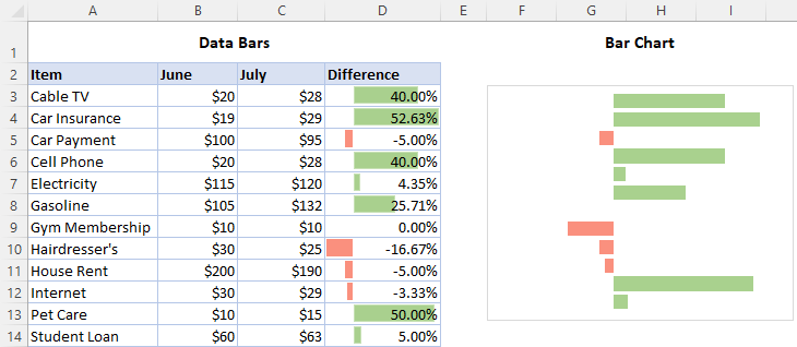
Data Bars in Excel are an inbuilt type of conditional formatting that inserts colored bars inside a cell to show how a given cell value compares to others. Longer bars represent higher values and shorter bars represent smaller values. Data bars can help you spot highest and lowers numbers in your spreadsheets at a glance, for example identify best-selling and worst-selling products in a sales report.
Conditional formatting data bars should not be confused with bar charts - kind of Excel graph that represents different categories of data in the form of rectangular bars. While a bar chart is a separate object that can be moved anywhere on the sheet, data bars always reside inside individual cells.
How to add data bars in Excel
To insert data bars in Excel, carry out these steps:
- Select the range of cells.
- On the Home tab, in the Styles group, click Conditional Formatting.
- Point to Data Bars and choose the style you want - Gradient Fill or Solid Fill.
Once you do this, colored bars will immediately appear inside the selected cells.
For example, this is how you make gradient fill blue data bars:

To add solid fill data bars in Excel, pick the color of your choice under Solid Fill:
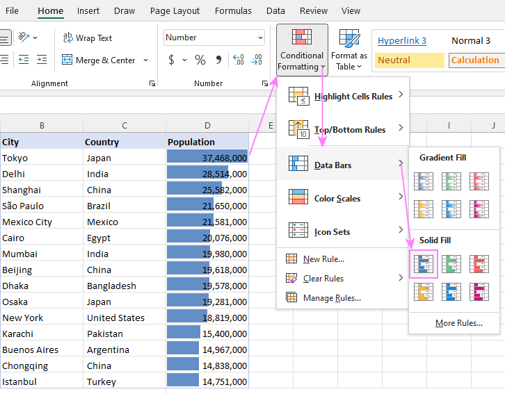
To fine-tune the appearance and settings your data bars, select any of the formatted cells, click Conditional Formatting > Manage Rule > Edit, and then choose the desired color and other options.
Tip. To make the differences among the bars more noticeable, make the column wider than usual, especially if the values are also displayed in cells. In a wider column, the values will be positioned over the lighter part of a gradient fill bar.
Which Data Bar fill type is better to choose?
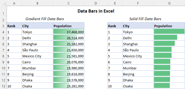
There are two bar styles in Excel - Gradient Fill and Solid Fill.
Gradient Fill is the right choice when both data bars and values are displayed in cells - lighter colors at the end of the bars make it easier to read the numbers.
Solid Fill is better to be used if only the bars are visible, and the values are hidden. See how to show only data bars and hide numbers.
How to create custom data bars in Excel
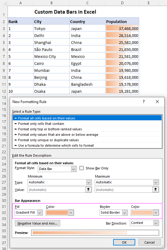
If none of the preset formats suits your needs, you can create a custom rule with your own data bar style. The steps are:
- Select the cells where you want to apply data bars.
- Click Conditional Formatting > Data Bars > More Rules.
- In the New Formatting Rule dialog box, configure these options:
- Choose the data type for Minimum and Maximum values. The default (Automatic) works fine in most cases. If you want more control over how the lowest and highest values are calculated, then choose Percent, Number, Formula, etc.
- Experiment with the Fill and Border colors until you are happy with the preview.
- Determine the Bar direction: context (default), left-to-right or right-to-left.
- If needed, tick the Show Bar Only checkbox to hide the cells values and only show colored bars.
- When done, click OK.
Below is an example of data bars with a custom gradient color. All other options are default.
How to define minimum and maximum data bars value in Excel
When applying preset data bars, the minimum and maximum values are set automatically by Excel. Instead, you can decide how to calculate these values. For this, do the following:
- If you are creating a new rule, click Conditional Formatting > Data Bars > More Rules.
If you are editing an existing rule, then click Conditional Formatting > Manage Rule. In the list of rules, select your Data Bar rule, and click Edit.
- In the rule dialog window, under the Edit the Rule Description section, choose the options you want for Minimum and Maximum values.
- When done, click OK.
For example, you can set data bar percentage, with the minimum value equal to 0% and the maximum value equal to 100%. As a result, the highest value bar will occupy the whole cell. For the lowest value, there will be no bar visible.
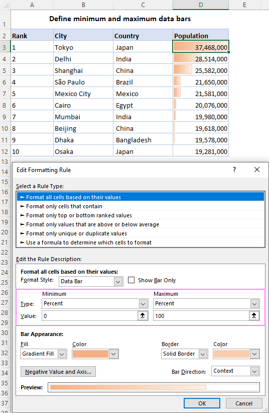
Create Excel data bar based on formula
Instead of defining certain values, you can calculate the MIN and MAX values using the corresponding function. For better visualization, we apply the following formulas:
For the Minimum value, the formula sets the minimum 5% below the lowest value in the referenced range. This will display a tiny bar for the lowest cell. (If you use the MIN formula in its pure form, there will be no bar visible in that cell).
=MIN($D$3:$D$12)*0.95
For the Maximum value, the formula sets the maximum 5% above the highest value in the range. This will add a small space at the end of the bar, so that it does not overlap the entire number.
=MAX($D$3:$D$12)*1.05

Excel data bars based on another cell value
In case of preset conditional formatting, there is no obvious way to format given cells based on values in other cells. When using data bars of a very bright or dark color, such an option would be extremely helpful not to obscure values in cells. Luckily there is a very easy workaround.
To apply data bars based on a value in a different cell, this is what you need to do:
- Copy the original values in an empty column where you want the bars to appear. To keep the copied values linked to the original data, use a formula like =A1 assuming A1 is the topmost cell holding your numbers.
- Add data bars to the column where you've copied the values.
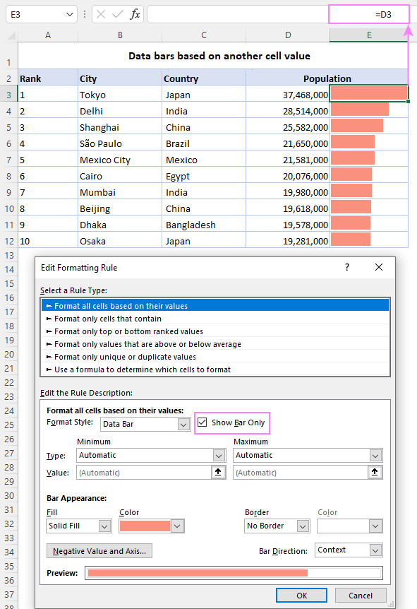
- In the Formatting Rule dialog box, put a tick in the Show Bar Only check box to hide the numbers. Done!
In our case, the numbers are in column D, so the formula in E3 copied down is =D3. As a result, we have the values in column D and data bars in column E:
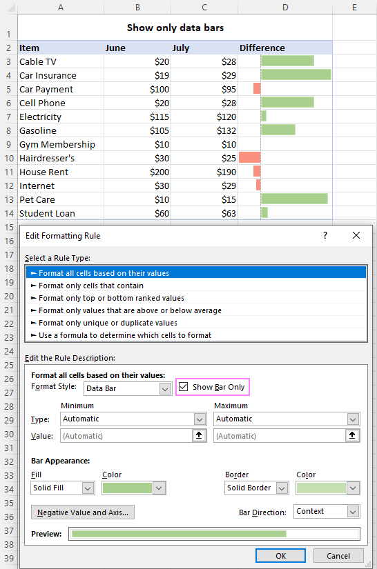
If your dataset contains both positive and negative numbers, you'll be glad to know that Excel data bars work for negative numbers as well. To apply different bar colors for positive and negative numbers, this is what you do: Now, you can identify negative numbers by casting a quick look at your dataset.
Showing and hiding values in formatted cells is just a matter of a single tick mark :) If you wish to only see colored bars and no numbers, in the Formatting Rule dialog box, select the Show Bar Only check box. That's it!
Excel data bars for negative values


How to show only bars without values
This is how to add data bars in Excel. Very easy and so very useful!
Practice workbook for download
Data bars in Excel - examples (.xlsx file)
 by
by
8 comments
I have a created a data bars for my data set. Is there a way to include a data bar for the median value of the data set within each cell so I can quickly see if the value is above or below the median?
Hello Keri!
You can calculate the deviation from the median for each cell. To highlight the results, you can use conditional formatting as described here: Excel conditional formatting formulas based on another cell.
I have placed check boxes in 5 cells in each of my rows (Rows 3 through 42, Columns F through J). I then set a formula (=COUNTIF(F3:J3,TRUE)/COLUMNS(F3:J3) to show percentage of boxes with a TRUE value checked off for the corresponding cells in the row. When I check 1, 2, 3, 4, or 5 boxes, no matter how many I check or uncheck, the gradient bar shows 100% (except no checks at all, the gradient reflects nothing, and this is correct). The only way for all rows to operate correctly is if I have 100% checks in row 3 (my first data row). Can you help me get all rows to show the correct gradient length in cell L bases on percentage?
Hi! In the cell where your formula is written, create a Data Bar. The minimum value is 0, the maximum value is 1.
Hi. I have a simple table showing numbers of M and F students in my school. I would like to use conditional formatting and gradient data bars to easily see the difference in the two numbers. I would like to color code the F pink and the M blue. How do I manage this simple task?
Hi! If I understand your task correctly, this article may be helpful: How to change background color in Excel based on cell value.
Is there any way to format a data bar in a text cell using number values from a different column in the table?
Hi!
With conditional formatting, you can only change the format of a cell.