In this tutorial, you will learn how to make a bar graph in Excel and have values sorted automatically descending or ascending, how to create a bar chart in Excel with negative values, how to change the bar width and colors, and much more.
Along with pie charts, bar graphs are one of the most commonly used chart types. They are simple to make and easy to understand. What kind of data are bar charts best suited for? Just any numeric data that you want to compare such as numbers, percentages, temperatures, frequencies or other measurements. Generally, you would create a bar graph to compare individual values across different data categories. A specific bar graph type called Gantt chart is often used in project management programs.
In this bar chart tutorial, we are going to explorer the following aspects of bar graphs in Excel:
Bar charts in Excel - the basics
A bar graph, or bar chart is a graph that displays different categories of data with rectangular bars, where the lengths of the bars are proportional to the size of the data category they represent. Bar graphs can be plotted vertically or horizontally. A vertical bar graph in Excel is a separate chart type, known as a column bar chart.
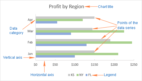
To make the rest of this bar chart tutorial easier to comprehend and to ensure that we are always on the same page, let's define the basic elements of an Excel bar graph. The following image shows the standard 2-D clustered bar chart with 3 data series (grey, green and blue) and 4 data categories (Jan - Apr).
How to make a bar graph in Excel
Making a bar graph in Excel is as easy as it could possibly be. Just select the data you want to plot in your chart, go to the Insert tab > Charts group on the ribbon, and click the bar chart type you want to insert.
In this, example, we are creating the standard 2-D Bar chart:
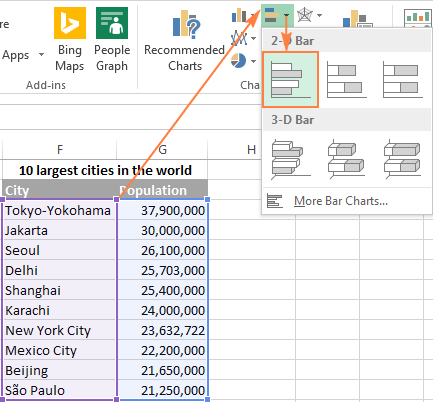
The default 2-D clustered bar graph inserted in your Excel worksheet will look something like this:
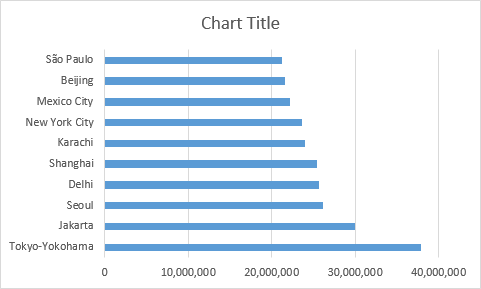
The Excel bar graph above displays one data series because our source data contains just one column of numbers.
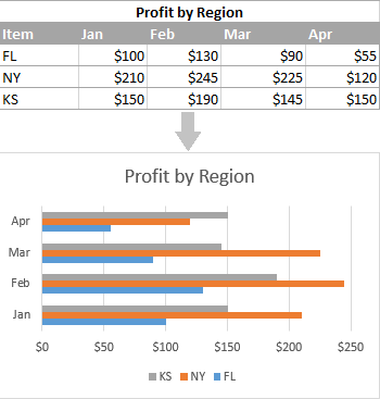
If your source data has two or more columns of numerical values, your Excel bar graph will contain several data series, each shaded in a different color:
View all available bar chart types
To see all bar graph types available in Excel, click the More Column Charts... link, and choose one of the bar chart sub-types that are displayed at the top of the Insert Chart window:
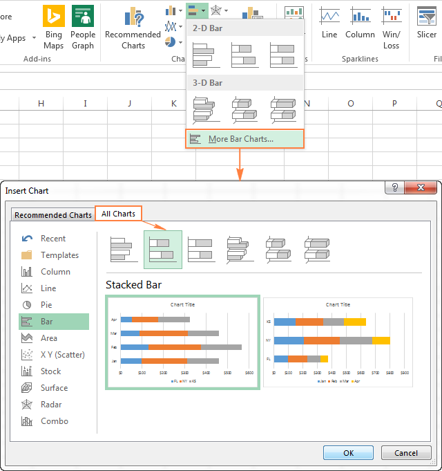
Choose the bar graph layout and style
If you are not fully satisfied with the default layout or style of the bar graph inserted in your Excel sheet, select it to activate the Chart Tools tabs on the ribbon. After that, go to Design tab and do any of the following:
- Try different bar graph layouts by clicking the Quick Layout button in the Chart Layouts group, or
- Experiment with various bar chart styles in the Chart Styles group.

Tip. If you are planning to create a progress bar chart in Excel for showing task completion visually, a 2-D bar graph is the best type to start with.
Excel bar chart types
When you make a bar chart in Excel, you can choose one of the following bar graph sub-types.
Clustered bar charts
A clustered bar chart in Excel (2-D or 3-D) compares values across data categories. In a clustered bar graph, the categories are typically organized along the vertical axis (Y axis), and the values along the horizontal axis (X axis). A 3-D clustered bar chart does not display a 3rd axis, but rather presents horizontal rectangles in 3-D format.

Stacked bar charts
A stacked bar graph in Excel shows the proportion of individual items to the whole. As well as clustered bar graphs, a stacked bar chart can be drawn in 2-D and 3-D format:

100% stacked bar charts
This type of bar graphs is similar to the above type, but it displays the percentage that each value contributes to a total in each data category.

Cylinder, cone and pyramid charts
Like standard rectangular Excel bar charts, cone, cylinder and pyramid graphs are available in clustered, stacked, and 100% stacked types. The only difference is that these chart types represent data series in the form or cylinder, cone, and pyramid shapes instead of bars.

In Excel 2010 and earlier versions, you can create a cylinder, cone, or pyramid chart in the usual way, by selecting the corresponding graph type in the Charts group on the Insert tab.
When creating a bar graph in Excel 2013 or Excel 2016, you won't find the cylinder, cone or pyramid type in the Charts group on the ribbon. According to Microsoft, these graph types were removed because there were too many chart choices in earlier Excel versions, which made it difficult for the user to choose the right chart type. And still, there is a way to draw a cylinder, cone or pyramid graph in the modern versions of Excel, this will just take a couple of extra steps.
Creating a cylinder, cone and pyramid graph in Excel 2013 and 2016
To create a cylinder, cone or pyramid graph in Excel 2016 and 2013, make a 3-D bar chart of your preferred type (clustered, stacked or 100% stacked) in the usual way, and then change the shape type in the following way:
- Select all the bars in your chart, right click them, and choose Format Data Series... from the context menu. Or, just double click the bars.
- On the Format Data Series pane, under Series Options, select the Column shape you want.

Note. If several data series are plotted in your Excel bar chart, you might need to repeat the above steps for each series.
Customizing bar graphs in Excel
Like other Excel chart types, bar graphs allow for many customizations with regard to the chart title, axes, data labels, and so on. The following resources explain the detailed steps:
- Adding the chart title
- Customizing chart axes
- Adding data labels
- Adding, moving and formatting the chart legend
- Showing or hiding the gridlines
- Editing data series
- Changing the chart type and styles
- Changing the default chart colors
And now, let's have a closer look at a couple of specific techniques pertaining to Excel bar charts.
Change the bar width and spacing between the bars
When you do a bar graph in Excel, the default settings are such that there's quite lot of space between the bars. To make the bars wider and get them to appear closer to each other, perform the following steps. The same method can be used to make the bars thinner and increase the spacing between them. In 2-D bar charts, the bars can even overlap each other.
- In your Excel bar chart, right click any data series (the bars) and choose Format Data Series... from the context menu.
- On the Format Data Series pane, under Series Options, do one of the following.
- In 2-D and 3-D bar graphs, to change the bar width and spacing between data categories, drag the Gap Width slider or enter a percentage between 0 and 500 in the box. The lower the value, the smaller the gap between the bars and thicker the bars, and vice versa.
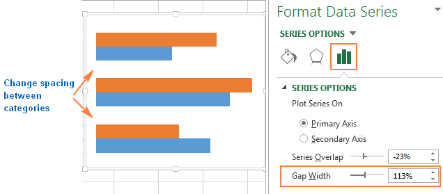
- In 2-D bar charts, to change the spacing between data series within a data category, drag the Series Overlap slider, or enter a percentage between -100 and 100 in the box. The higher the value, the greater the bars overlap. A negative number will result in a spacing between the data series like in the following screenshot:

- In 3-D charts, to change the spacing between data series, drag the Gap Depth slider, or enter a percentage between 0 and 500 in the box. The higher the value, the greater the gap between the bars. In practice, changing the gap depth does have a visual effect in most of Excel bar chart types, but it does make a noticeable change in a 3-D column chart, as shown in the following image:

Create Excel bar charts with negative values
When you make a bar graph in Excel, the source values do not necessarily need to be greater than zero. Generally, Excel has no difficulty with displaying negative numbers on a standard bar graph, however the default chart inserted in your worksheet might leave much to be desired in terms of layout and formatting:

For the above bar chart to look better, firstly, you might want to move the vertical axis labels to the left so they won't overlay the negative bars, and secondly, you can consider using different colors for negative values.
Modifying the vertical axis labels
To format the vertical axis, right click any of its labels, and select Format Axis... from the context menu (or simply double-click the axis labels). This will make the Format Axis pane appear on the right side of your worksheet.
On the pane, go to the Axis Options tab (the rightmost one), expand the Labels node, and set the Label Position to Low:
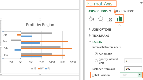
Changing the fill color for negative values
If you want to draw attention to the negative values in your Excel bar graph, changing the fill color of negative bars would make them stand out.
If your Excel bar chart has just one data series, you can shade negative values in standard red. If your bar graph contains several data series, then you will have to shade negative values in each series with a different color. For example, you can keep the original colors for positive values, and use lighter shades of the same colors for negative values.
To change the color of negative bars, perform the following steps:
- Right click on any bar in the data series whose color you want to change (the orange bars in this example) and select Format Data Series... from the context menu.
- On the Format Data Series pane, on the Fill & Line tab, check the Invert if Negative box.
- As soon as you put a tick in the Invert if Negative box, you should see two fill color options, the first for positive values and the second for negative values.
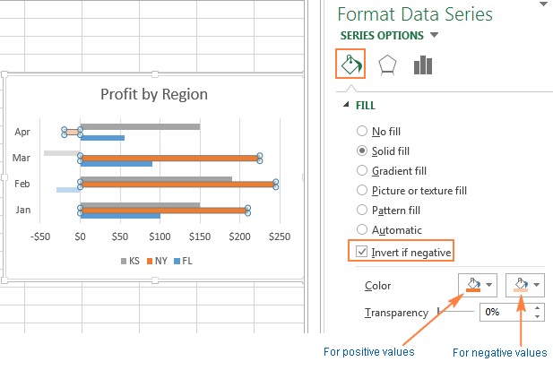
Tip. If the second fill box does not show up, click the little black arrow in the only color option that you see, and choose any color you want for positive values (you can select the same color as was applied by default). Once you do this, the second color option for negative values will appear:

Sorting data on bar charts in Excel
When you create a bar graph in Excel, by default the data categories appear in the reverse order on the chart. That is, if you sort the data A-Z on the spreadsheet, your Excel bar chart will show it Z-A. Why does Excel always put data categories backwards in bar charts? No one knows. But we do know is how to fix this :)
The easiest way to reverse the order of data categories on a bar chart is to do the opposite sort on the sheet.
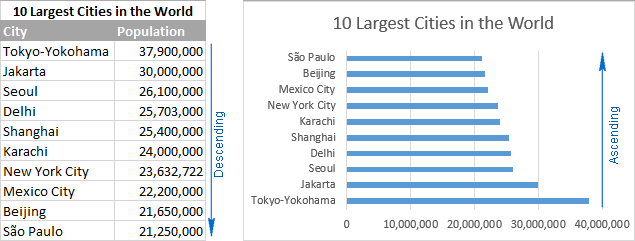
Let's use some simple data to illustrate this. In a worksheet, I have a list of 10 largest cities in the world sorted by population in descending order, from highest to lowest. On the bar chart, however, the data appears in ascending order, from lowest to highest:
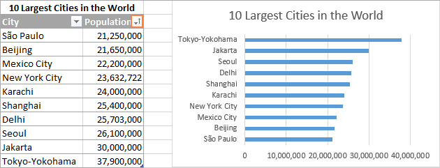
To have your Excel bar graph sorted from top down, you simply arrange the source data in the opposite way, i.e. from smallest to largest:
If sorting the data on the sheet is not an option, the following section explains how to change the sort order on an Excel bar graph without sorting the data source.
Sort an Excel bar graph descending / ascending without sorting source data
If the sort order on your worksheet does matter and cannot be changed, let's make the bars on the graph appear exactly in the same order. It's easy, and only requires selecting a couple of tick-box options.
- On your Excel bar graph, right click any of the vertical axis labels, and select Format Axis... from the context menu. Or, just double click the vertical axis labels for the Format Axis pane to appear.
- On the Format Axis pane, under Axis Options, select the following options:
- Under Horizontal axis crosses, check the At maximum category
- Under Axis position, check the Categories in reverse order
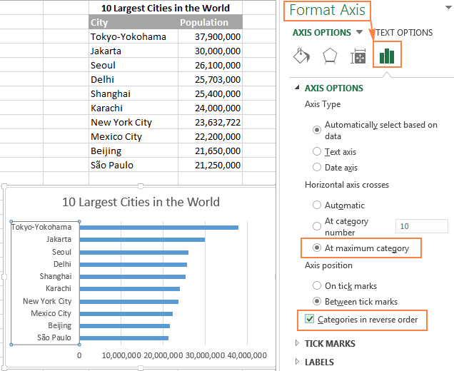
Done! Your Excel bar graph will be immediately sorted in the same way as the data source, descending or ascending. As soon as you change the sort order on the sheet, the bar chart will be re-sorted automatically.
Changing the order of data series in a bar chart
If your Excel bar graph contains several data series, they are also plotted backwards by default. For example, notice the reverse order of regions on the worksheet and on the bar chart:

To arrange the data series on the bar graph in the same order as they appear on the worksheet, you can check the At maximum category and Categories in reverse order options, as demonstrated in the previous example. This will also change the plot order of data categories, as shown in the following screenshot:

If you want to arrange the data series on the bar chart in a different order than the data is organized on the worksheet, you can do this by using:
Change the order of data series using the Select Data Source dialog
This method allows you to change the plotting order of each individual data series on a bar graph and retain the original data arrangement on the worksheet.
- Select the chart to activate the Chart Tools tabs on the ribbon. Go to the Design tab > Data group, and click the Select Data button.
Or, click the Chart Filters button on the right of the graph, and then click the Select Data... link at the bottom.

- In the Select Data Source dialog, select the data series whose plot order you want to change, and move it up or down by using the corresponding arrow:

Reorder data series by using formulas
Since each data series in an Excel chart (not only in bar graphs, just in any chart) is defined by a formula, you can change the data series by modifying the corresponding formula. The detailed explanation of the data series formulas is provided here. For now, we are interested only in the last argument that determines the plot order of the series.
For example, the grey data series is plotted 3rd in the following Excel bar chart:

To change the plotting order of a given data series, select it on the chart, go to the formula bar, and replace the last argument in the formula with some other number. In this bar chart example, to move the grey data series one position up, type 2, to make it the first series in the graph, type 1:

As well as the Select Data Source dialog, editing the data series formulas changes the series order on the graph only, the source data on the worksheet remains intact.
This is how you make bar graphs in Excel. To learn more about Excel charts, I encourage you to check out a list of other resources published at the end of this tutorial. Thank you for reading and hope to see you on our blog next week!
 by
by