The tutorial shows how to make and use error bars in Excel. You will learn how to quickly insert standard error bars, create your own ones, and even make error bars of different size that show your own calculated standard deviation for each individual data point.
Many of us are uncomfortable with uncertainty because it is often associated with lack of data, ineffective methods or wrong research approach. In truth, uncertainty is not a bad thing. In business, it prepares your company for the future. In medicine, it generates innovations and leads to technological breakthroughs. In science, uncertainty is the beginning of an investigation. And because scientists love quantifying things, they found a way to quantify uncertainty. For this, they calculate confidence intervals, or margins of error, and display them by using what is known as error bars.
How to add error bars in Excel
In Excel 2013 and higher, inserting error bars is quick and straightforward:
- Click anywhere in your graph.
- Click the Chart Elements button to the right of the chart.
- Click the arrow next to Error Bars and pick the desired option:
- Standard Error - displays the standard error of the mean for all values, which shows how far the sample mean is likely to be from the population mean.
- Percentage - adds error bars with the default 5% value, but you can set your own percentage by choosing More Options.
- Standard Deviation - shows the amount of variability of the data, i.e. how close it is to the average. By default, the bars are graphed with 1 standard deviation for all data points.
- More Options… - allows specifying your own error bar amounts and creating custom error bars.
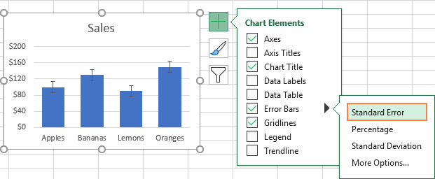
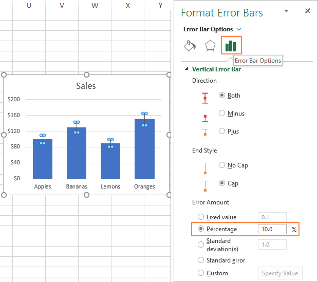
Picking More Options opens the Format Error Bars pane where you can:
- Set your own amounts for fixed value, percentage and standard deviation error bars.
- Choose the direction (positive, negative, or both) and end style (cap, no cap).
- Make custom error bars based on your own values.
- Change the appearance of error bars.
As an example, let's add 10 % error bars to our chart. For this, select Percentage and type 10 in the entry box:
Tips
- To add standard error bars in Excel, you can simply select the Error Bars box without picking any option. The standard error bars will be inserted by default.
- To customize the existing error bars, double-click them in the chart. This will open the Format Error Bars pane, where and you change error bars type, choose another color and do other customizations.
How to do error bars in Excel 2010 and 2007
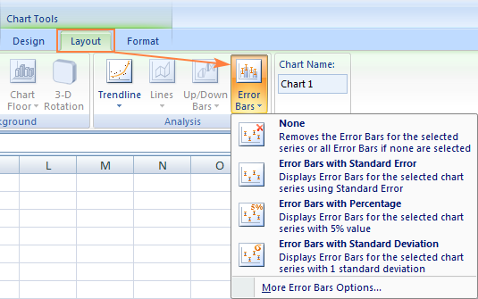
In earlier versions of Excel, the path to error bars is different. To add error bars in Excel 2010 and 2007, this is what you need to do:
- Click anywhere in the chart to activate Chart Tools on the ribbon.
- On the Layout tab, in the Analysis group, click Error Bars and choose one of the following options:
How to add custom error bars in Excel
The standard error bars provided by Excel work fine in most situations. But if you wish to display your own error bars, you can easily do that too.
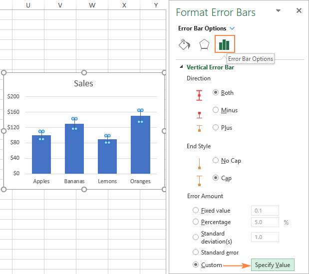
To make custom error bars in Excel, carry out these steps:
- Click the Chart Elements button.
- Click the arrow next to Error Bars and then click More Options…
- On the Format Error Bars pane, switch to the Error Bars Options tab (the last one). Under Error Amount, select Custom and click the Specify Value button.
- A small Custom Error Bars dialog box appears with two fields, each containing one array element like
={1}. You can now enter your own values in the boxes (without equality sign or curly braces; Excel will add them automatically) and click OK.
If you do not want to display positive or negative error bars, enter zero (0) in the corresponding box, but don't completely clear the box. If you do that, Excel will think you simply forgot to input a number and it will retain the previous values in both boxes.
This method adds the same constant error values (positive and/or negative) to all data points in a series. But in many cases, you will want to put an individual error bar to each data point, and the following example shows how to do this.
How to make individual error bars in Excel (of different lengths)
When using any of the inbuild error bars options (standard error, percentage or standard deviation), Excel applies one value to all data points. But in some situations, you may want to have your own calculated error values on individual points. In other words, you wish to plot error bars of different lengths to reflect different errors for each data point on the graph.
In this example, I'll show you how to make individual standard deviation error bars.
To begin with, enter all the error bar values (or formulas) into separate cells, usually in the same columns or rows as the original values. And then, tell Excel to graph error bars based on those values.
Tip. Optionally, you can fill two separate rows/columns with your error values - one for positive and the other for negative.
Supposing, you have 3 columns with sales numbers. You have calculated an average (B6:D6) for each column and plotted those averages in a chart. Additionally, you found the standard deviation for each column (B7:D7) by using the STDEV.P function. And now you wish to display those numbers in your graph as standard deviation error bars. Here's how:
- Click the Chart Elements button> > Error Bars > More Options….
- On the Format Error Bars pane, select Custom and click the Specify Value button.
- In the Custom Error Bars dialog box, delete the contents of the Positive Error Value box, put the mouse pointer in the box (or click the Collapse Dialog icon next to it), and select a range in your worksheet (B7:D7 in our case).
- Do the same for Negative Error Value box. If you do not want to display negative error bars, type 0.
- Click OK.
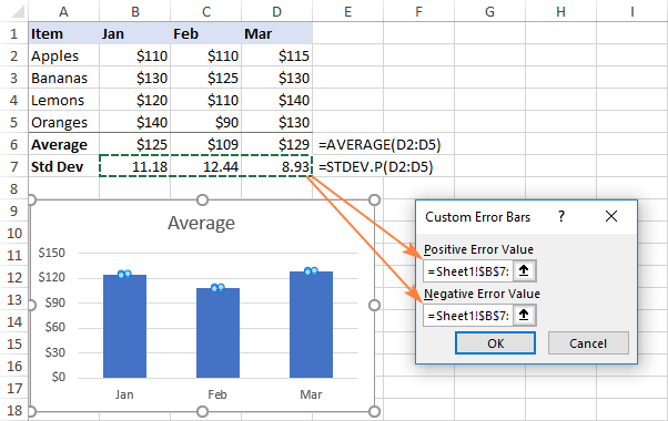
Important note! Be sure to delete the entire contents of the entry boxes before selecting a range. Otherwise, the range will be added to the existing array like shown below, and you will end up with an error message:
={1}+Sheet1!$B$7:$D$7
It is quite difficult to spot this error because the boxes are narrow, and you cannot see all the contents.
If all done correctly, you will get individual error bars, proportional to the standard deviation values that you've calculated:

How to add horizontal error bars in Excel
For most chart types, only vertical error bars are available. Horizontal error bars can be added to bar charts, XY scatter plots, and bubble charts.
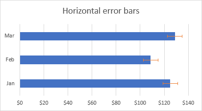
For bar charts (please do not confuse with column charts), horizontal error bars are the default and only available type. The screenshot below shows an example of a bar chart with error bars in Excel:
In bubble and scatter graphs, error bars are inserted for both x values (horizontal) and y values (vertical).
If you'd like to only insert horizontal error bars, simply remove vertical error bars from your chart. Here's how:
- Add error bars to your chart as usual.
- Right-click any vertical error bar and choose Delete from the pop-up menu.
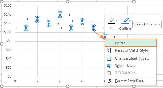
This will remove vertical error bars from all data points. You can now open the Format Error Bars pane (for this, double-click on any of the remaining error bars) and customize the horizontal error bars to your liking.

How to make error bars for a specific data series
Sometimes, adding error bars to all data series in a chart could make it look cluttered and messy. For example, in a combo chart, it often makes sense to put error bars to only one series. This can be done with the following steps:
- In your chart, select the data series to which you want to add error bars.
- Click the Chart Elements button.
- Click the arrow next to Error Bars and pick the desired type. Done!
The screenshot below shows how to do errors bars for the data series represented by a line:
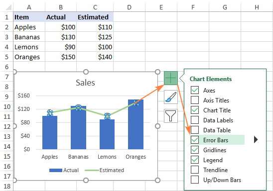
As the result, the standard error bars are inserted only for the Estimated data series that we selected:

How to modify error bars in Excel
To change the type or appearance of the existing error bars, perform these steps:
- Open the Format Error Bars pane by doing one of the following:
- Click the Chart Elements button > Error Bars > More Options…
- Right-click error bars and select Format Error Bars from the context menu.
- Double-click the error bars in your chart.
- To change type, direction and end style of the error bars, switch to the Options tab (the last one).
- To change the color, transparency, width, cap, join and arrow type, go to the Fill & Line tab (the first one).

How to delete error bars in Excel
To remove all error bars from your graph, click anywhere within the chart, then click the Chart Elements button and clear the Error Bars check box. The shortest instruction ever :)
To delete error bars for a specific data series, click on that data series to select it, then click the Chart Elements button and uncheck the Error Bars box.
If a data series has both vertical and horizontal error bars and you wish to delete the "extras", right-click the superfluous bars, and choose Delete from the context menu.
That's how you do error bars in Excel. I thank you for reading and hope to see you on our blog next week!
Practice workbook for download
Excel Error Bars examples (.xlsx file)
 by
by 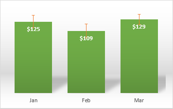
10 comments
Your instruction for how to delete error bars is frivolous. I have multiple series and for some reason there are vertical and horizontal error bars for every series. How do I delete the extras?
Hi Dean,
To delete the extras, right-click the unwanted error bars (vertical or horizontal) on the chart, and choose Delete from the context menu. Repeat this for each data series.
We show how to remove only the vertical error bars in the "How to add horizontal error bars in Excel" example. Please check it out for the detailed instructions with a screenshot.
I've also added this instruction to the "Delete error bars" section. Thank you for your question :)
How do i assign error bars of different lengths to different points on a graph? Currently Excel will only allow me to assign error bars all of the same length to the points.
Set up 2 new columns in your table - one for positive error and the other for negative error. Fill these with the error values you want to use.
When selecting the type of error bar, choose 'Custom'. Click the 'Specified Value' button. You should see a cell pop up where you can enter a values for positive and negative with a little chart at the end. Click the chart button and it will allow you to highlight the column in your table with your chosen values. Do this for positive and negative, hit enter and you should be good to go.
This worked perfectly thanks heaps!!!
This worked!!! Thanks so much
Hello, did you figure out how to do this? Thanks. xx
Please see this example: How to make individual error bars of different lengths. It does exactly what you are looking for.
hello. unfortunately this did not work for me; my error bars are not the correct values despite trying very many times. i have uncertainties in a column next to my data. selecting "custom" on the error bar option tab, then selecting with the mouse the column that has the error values in it does not work. what do i do? thank you.
Same question. I am plotting Averages on a simple bar graph and each data point (average) has a different set of numbers and different error for each bar on the graph. Is there a way to plot error bars of different lengths on same graph?