Some tips, tricks and techniques for better looking charts in Microsoft Excel.
The charting tools in the modern versions Microsoft Excel are way better in looks and functionality from those that were available in earlier Excel versions. While the charts look better, not all the options you can use to make them more functional are immediately apparent. In this post I'll show you some handy tips, tricks and techniques for creating charts in Excel that will help you get your work done more effectively.
Black and white patterns
New to Microsoft Office 2010 is the ability to use grayscale pattern fills for your chart. To see this at work select a chart and choose Chart Tools > Layout Tab and select the series to edit from the dropdown box at the top left of the ribbon. Choose Format Selection (just below this on the ribbon) and choose Fill > Pattern Fill. For a monochrome chart set the foreground color to black and the background color to white and select a fill pattern for the series. Repeat this this for the second series choosing a different pattern. You don't have to use black and white as your colors just choose different patterns to ensure the charts can be understood when printed on a monochromatic printer or photocopied in black and white.
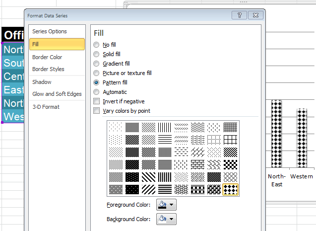
You can fill a chart with a pattern in Excel 2010 and higher, so it can be printed on a monochrome printer or photocopied in black and white.
Save an Excel chart as a picture
You can save a chart as a picture from inside Excel so you can use it elsewhere such as in a report or on the web. To do this you will use a workaround and the simplest way to do it is to size the chart on the worksheet so it is a good size. Choose File > Save As, select the location to save the file in and from the Save As Type dropdown list choose Web Page (*.htm;*.html), type a name and click Save.
This converts the worksheet to an html file and because html files cannot contain images the chart is saved separately and linked to the html file. You can find your chart in the folder that you saved the html file into. So, if your file was called sales.htm then the images will be in a folder called sales_files . The image is saved as a standalone PNG file. Of course, you'll also need to save your Excel worksheet if you want to save the data and chart to work on in Excel in future.
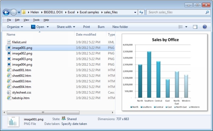
You can save a chart as an image file if you need to use it in another project later on.
For more information, please see How to save Excel graph as picture.
Adjusting column overlap and spacing
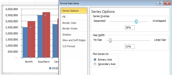
If you think your chart would look better if the columns were wider or if they overlapped you can do this. To adjust the overlap between two chart series or to change the spacing between columns, right click any series on the chart and choose Format Data Series. Use the Series Overlap option to spread the series apart by dragging towards Separated or Overlap the series by dragging towards Overlapped.
You can adjust the Gap Width to move the series closer together or further apart. If you have two chart series that you want to overlap and if the smaller series ends up behind the larger one you will need to change the chart plot order. First set the overlap so they overlap as you want them to do. Then right click the data series you can see and choose Select Data. Click on Series 1 and select the Move Down button to place it behind Series 2. This changes the order that they are plotted in so you can see the smaller data in front of the larger data.
Larger bars
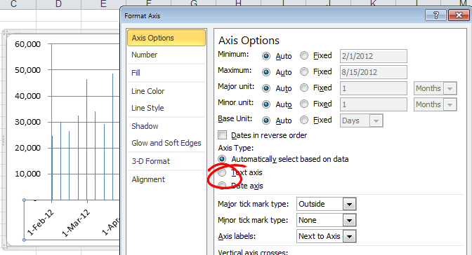
When you are plotting date-based data, you may find that the bars in your chart are very narrow. The solution for this is to click the Excel chart's X axis, right click and choose Format Axis. Select Axis Options and then click on Text Axis to select it. This changes the way the axis is plotted giving wider bars. You can then adjust the gap width if necessary to make them wider.
Plotting on a second axis
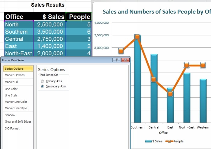
When you are plotting very small data such as percentages against much larger data like millions the percentages will get lost and will not be visible. You can solve the problem by plotting the percentages against a different axis. Select the chart and choose Chart Tools > Layout Tab and then from the chart element selector in the top left corner, select the series that is difficult to see. Click Format Selection which appears immediately below this and from the series option group, select Secondary Axis and click Close. Without moving the selection, choose Chart Tools > Design Tab and choose Change Chart Type. You can now select a different chart type such as line. Because you have a series selected that will applied to only that series not the entire chart so you will end up with a combination chart with for example a column chart with a line chart over the top. I like the text on the chart axis to match the color of the relevant part of the chart that that relates to. So if I have green bars I'll type green text on the axis relating to that and a red line will have a red font on its axis.
Creating combination charts
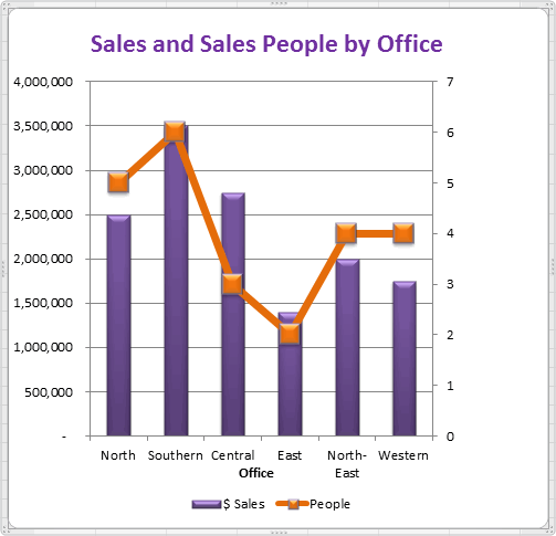
Microsoft Excel does not make it clear that you can create combination charts; however it's easily possible to do so. To do this, select the data and plot the first chart type such as a column chart. Then select the series that you want to show in a different way such as a line chart and choose Chart Tools > Design Tab > Change Chart Type and select the second chart type. Some types cannot be combined sensibly such as bar and column but a line and column chart work well together.
Auto growing Excel charts
If you have data that is going to grow over time you can create your chart so that it will get bigger as more data is added into your data store. To do this, format your data as a table by selecting the data and from the Home Tab on the ribbon, choose Format as Table. Now because your data is formatted as a table if you base your chart on the table data, adding more data to the table will grow the chart automatically.
Smarter chart title
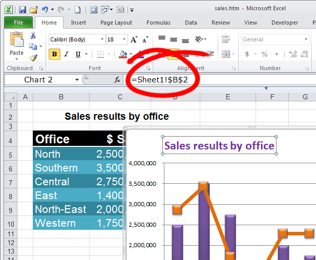
You can have the chart title lift its contents from a cell on the worksheet. First add a chart title using Chart Tools > Layout Tab > Chart Title and position it for example above the chart. Click in the box for the chart title then click on the formula bar on the ribbon and type the cell reference of the cell containing the data to place as the chart title. If you need to preface it with the sheet name so D5 on sheet 1 should read blank. Now whenever the contents of that cell are changed so too will the chart title change.
Variable colors for Excel charts
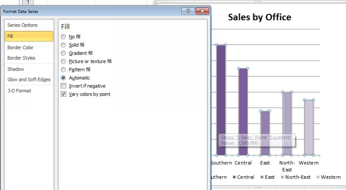
When you have a chart that plots only one data range, you will find that Excel colors every bar the same color. You can change this by clicking on the series, right click and choose Format Data Series and then Fill. If only one series is included in the chart then an option Vary colors by point will be selectable.
Of course, you can always click an individual series to select it, right click and choose Format Data Point and then set a specific color for that data point.
Controlling zeros and missing data
When you have zero values or missing data in a chart you can control how the zeros are shown by selecting the chart series then choose Chart Tools > Design Tab and click Select Data > Hidden and Empty Cells. Here you can select whether empty cells are shown as gaps, zero or if the chart is a line chart whether the data point should be connected with a line. Click Ok when you've made your choice.
Note. This is only for missing values not zeros.
Charting noncontiguous data
To chart data that is not lined up in columns side by side use the Excel shortcut of holding the Ctrl key as you select each data range. Once the ranges are selected, go ahead and create your chart from the selected data.
Save a chart as a template
To save a chart as a template so that you can reuse it over and over again first create the chart making it look the way you want it to look. Select it, click Chart Tools > Design Tab and click Save as Template. Type a name for the chart and click Save. You can later apply this format to another chart by using it when you create the chart or an existing chart to look like the one you have created. To do this, click the chart to select it, from the Chart Tools > Design Tab choose Change Chart Type, locate the templates option and select your template and click Ok.
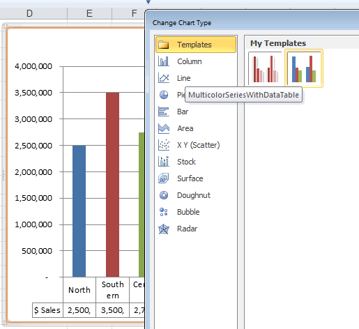
For more detail, see How to create a chart template in Excel.
Tip. You can also save the workbook with your favorite chart as an Excel template and reuse whenever you want.
These charting tips and tricks will get you started creating better looking charts faster and more effectively in Excel.
 by
by
48 comments
My excel chart not displaying if the value is 1. I selected "Stacked Bar".
I got below in the table
All Closed Remainings
Critical 1 1 0
High 2 2 0
Medium 0 1 0
Low 0 0 0
I don't know why, but my Critical item which is 1 item is always not displaying.
Appreciate your kind suggestion.
Hi! I can't help you to create a diagram in your workbook.
When I reduce gap between bars, the gap is reduced but the bars are resized and become thicker. Is there a way to reduce the gap but the bars do not get resized?
Hi,
I don't find option to adjust gap width in Format data series..for Line chart
Please advise..Thank you in advance..
I would like to have two different text colours in a Excel chart axis on the same line, for example Work = (45)
"Work =" in black text & the "(45)" in red text.
Is this possible?
It's very important to learn.
I am using a Stacked 3D Bar chart. The data labels are accurate, correct balances are pulled however the colors on the stack do not represent the appropriate %. For example. One column should be 98% blue, and 2% Orange, but the column looks 50/50 of each color. Please advise.
Thank you
i have an mcq please solve it for me
to edit a chart in ms excel a.single click on chart b. double click on chart c. triple click on chart d. click on chart label
Thanks
Colour dusre format m ho jha sabse badi digit ho uske name m hi na ki range me bt change hu mne range ki to colour bhi bhi dusri name m ho jaye
Is there a way to use reference cells to control the fill color of a chart based upon the data label, similar to Data Validation lists? We use a lot of charts to display similar information, and to manually adjust each chart for it's color is difficult.
Thanks for the tips on Gap & Overlap and Text vs. Date Axis. Both well written. Date vs. Text! Would have taken a lot of trial and error to figure out that MS is hiding a pencil-necked 'feature' behind "Automatically select..."
I have a chart that shows 2 columns of data in a year-over-year format. The X axis shows 2014 - 2015 with the month of January below, so you can see January for both years next to each other. There is a blue bar showing incoming values, and a red bar showing outgoing values for each month. The chart shows January - July currently for both 2014 and 2015. My question is this... Can the bars showing 2014 be a different colors than bars showing 2015?
When showing only a couple of months it isn't much of a problem, but with numerous months it tends to become a blue/red blur of data. If I can change the color of the bars in a year it would help show not only monthly comparisons, but also the yearly comparisons...
Any ideas or suggestions welcome.
I saw a line chart with over 50 data points in a report (PDF format) and would like to reproduce it in my own slide but I can't just copy and paste it as the original chart does not match my colour theme. Is it possible for me to create my own chart overlay on original chart and then drag the data point to the right spot? I tried doing it but I can't see the original chart once I put my own chart on top of it. Please help!
I want to create a stackered graph with minimum and maximum payscales shown in one bar. So far I have had two bars sitting next to each other but I know it is possible to have both in one bar. I have tried different methods without success. The bar is either to high as both payscales are stackered or when trying to overlap the bars the values somehow change when playing around with the formatting tools.
inj
Thank you guys for the super to the point assistance - I think you all are fantastic.
Hello,
I want to prepare a graphic;
Y axis cm and X axis mm, but after printing on paper it should be same with real cm, mm distance,
How can I do this
very educative
Hello Alexander,
Is it possible to manipulate the distance between the bars in a 2-D column chart, Excel 2007?
Can I send an email showing what I want exactly?
Please I need it for an assignment.
Thanks.
Benjamin
Hi Benjamin,
Please read through the section "Adjusting column overlap and spacing".
If manipulating with "Gap width" and "Series overlap" does not help you achieve the result you are looking for, then send me your sample data at alexander.frolov@ablebits.com.
Hi,
Is it possible to change the colours in a Excel 2010 bar chart depending on different ranges of the x-axis
For example, I have a bar chart of 30 columns of data each representing a different age.....I want the first 10 in blue, the second 10 in red and the last 10 in Green.
This is to group the data by colour within the bar chart.
Is this possible???
Thanks
In general, it is possible and you can find more information here:
http://www.clearlyandsimply.com/clearly_and_simply/2011/08/color-coded-bar-charts-with-microsoft-excel.html
If you need to know some particular details, I think you'd better contact the author of the solution, he would be able to give a more competent response :)