In this article, we'll guide you through the steps of adding a second vertical (y) or horizontal (x) axis to an Excel chart.
In Excel graphs, you're used to having one horizontal and one vertical axis to display your information. But things can get a bit tricky when you're dealing with different types of values, like numbers and percentages, or when you want to compare two datasets that don't quite match up in terms of time or size. This is where a second axis comes into play. A secondary axis in Excel charts lets you plot two different sets of data on separate lines within the same graph, making it easier to understand the relationship between them.
Why add a second axis to Excel chart?
Adding a second axis to your Excel chart might sound a bit technical, but it's all about enhancing clarity and insight. Here are some good reasons to consider using a second axis:
- Different kinds of data. Imagine you're dealing with numbers and percentages at the same time. Putting them on one line can be confusing. With a second axis, you can distinctly showcase both datasets.
- Significant differences in numbers. When comparing values that have very different sizes, like sales and taxes, one dataset might overshadow the other. A second axis ensures each dataset has its own space to shine.
- Time jumps. Visualizing information across various timeframes on a single axis can lead to distorted representations. A second axis lets you accurately depict each dataset's timeline.
- Intricate correlations. Sometimes, data conceals hidden relationships. Adding a second axis might uncover interesting connections that weren't obvious before.
- Enhanced storytelling. In presentations, reports, or academic papers, a chart with a second axis helps convey intricate information more effectively, showcasing how different variables interact.
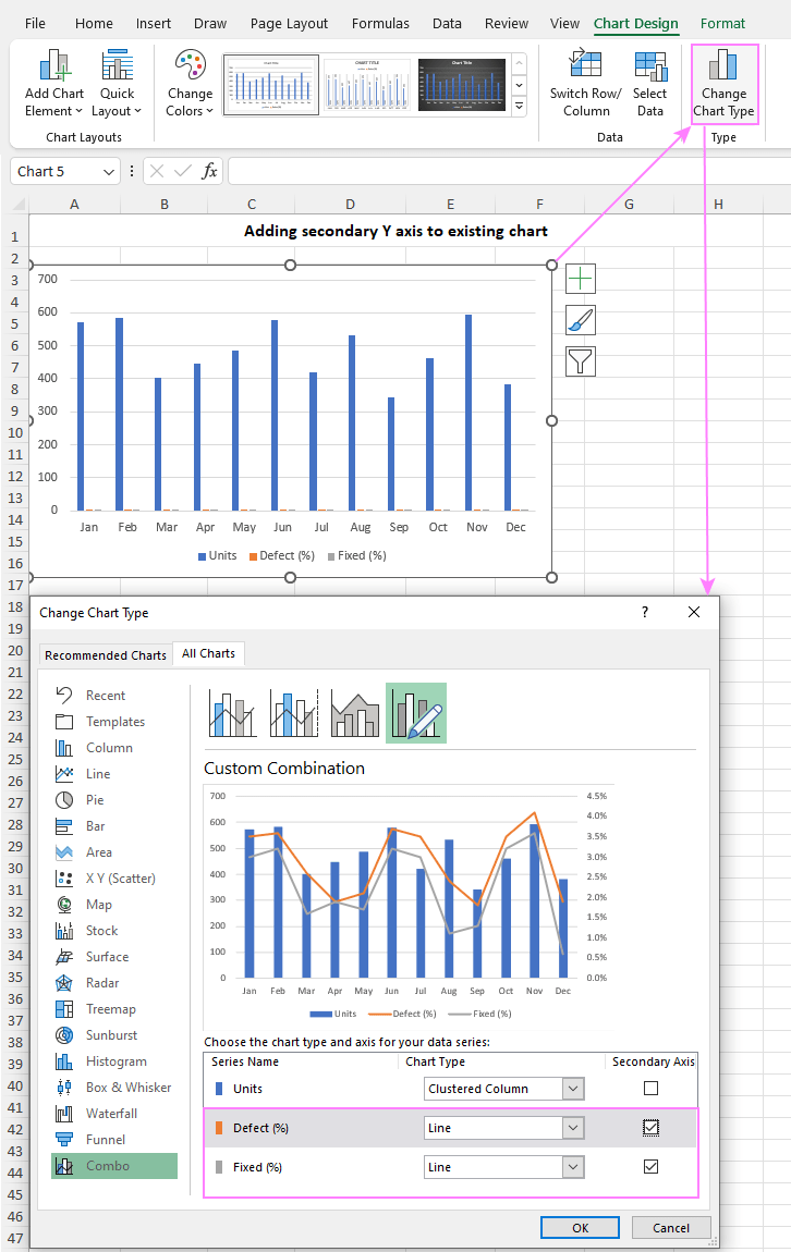
Let's delve into a real-life example that illustrates the advantages of using a second axis in Excel. Imagine you're visualizing production numbers and defect percentages each month in a manufacturing process. Below is a standard column chart displaying both datasets. The blue columns represent units produced, while the tiny orange columns next to them show defect percentages.
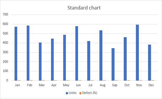
Now, take a moment and try to discern the relationship between the production numbers and defect percentages. It's a bit puzzling, isn't it? The standard graph doesn't allow for effective comparison of data with differing scales.
The solution is to create a separate vertical axis for percentages, scaling from 0% to 4.5%. A secondary axis works best for a combo chart, so we switch the defect percentage data series to a line, while keeping production numbers as columns. That's all! With the secondary axis in action, the relationship between production and defects becomes much clearer.
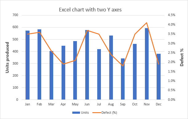
In essence, incorporating a second axis in an Excel chart isn't just about accommodating complex data - it's about enabling a clearer, more insightful representation of your information.
How to add a secondary axis in Excel
In older versions like Excel 2010, adding a second axis required a bunch of manipulations that could get a bit tricky. But luckily, in modern versions of Excel 2013 through 365, the process has become much easier and faster.
To add a second axis to your Excel chart, follow these steps:
- Pick your data. Select the data you want to plot, including column headers.
- Insert chart. On the Insert tab at the top, find the Charts group, and click on Recommended Charts.

- Use recommended charts. With a bit of luck, you might see a chart with a second axis right there among the recommendations on the left side of the Insert Chart dialog box. If you do, just pick it and click OK. You're all set. But if not, no worries - follow the next steps.
- Combo choice. If you don't see the right chart in the recommendations, stay in the same pop-up window, but move to the All Charts tab. On the left side, choose Combo.
- Combo setup. For one of your data series, pick Clustered Column, and for the other one, choose Line. Then - this is important - check the Secondary Axis box for the Line data series. Once you're set, hit OK.
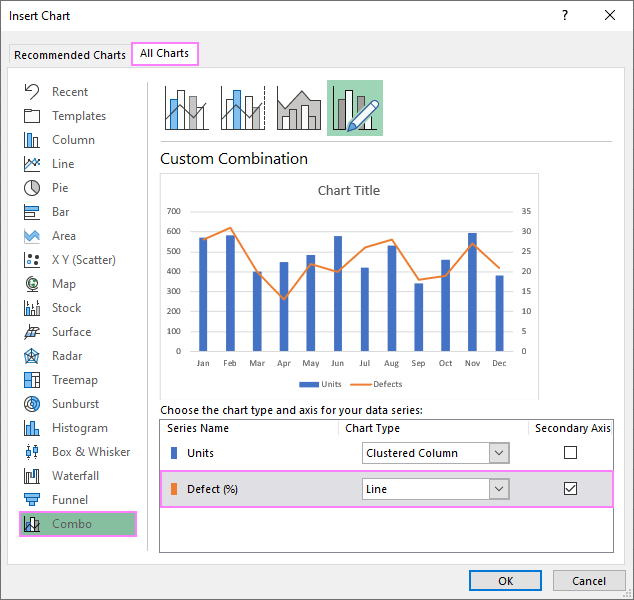
And guess what? You're all done! Your chart now has a second vertical y-axis.
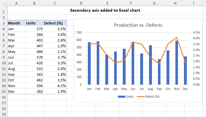
Tip. If you want to make your combo graph with a second axis even cooler, you can do more stuff like changing the chart title, adding axis titles, etc. For the detailed instructions, check out How to customize Excel graphs.
Adding a second Y axis to existing chart
In certain scenarios, it's quicker to add a second Y-axis to an existing chart than start a new one with two vertical axes from the ground up. Here's how you can do it:
- Select your chart. First, click anywhere within your graph to activate the Chart Tools tabs on the ribbon.
- Change chart type. On the Chart Design tab, which is now available, click the Change Chart Type button.
- Choose combo chart. In the dialog box that appears, select Combo in the left pane, and choose the Cluster Column - Line on Secondary Axis chart type.
- Adjust second axis (if needed). If your graph contains multiple data series, you have the flexibility to decide which one(s) to display on the secondary axis. Simply check the Secondary Axis box next to that specific series.
- Save changes. After making your selections, click OK to apply the changes and close the dialog box.
That's it! Your chart now has a second Y-axis, allowing you to effectively visualize different sets of data with varying scales or types.
How to add a secondary X axis in Excel
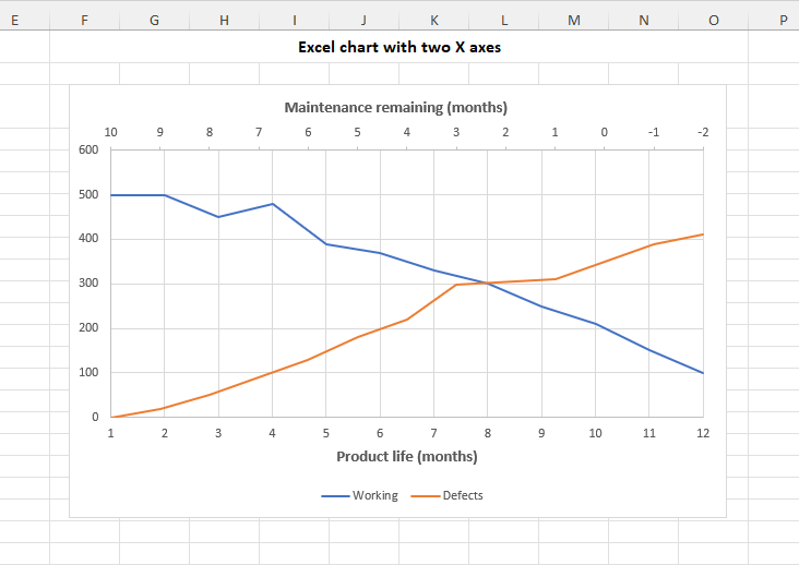
Adding a second horizontal X axis in Excel can be handy when you want to show two different sets of data for different time ranges. Unlike the y-axis, Excel doesn't provide an automatic way to add a second x-axis. But don't be uneasy, we'll guide you through it step by step.
To add a second X axis to your Excel chart, these are the steps to perform:
- Start fresh. Begin by creating a new graph from scratch, without selecting any data in your worksheet. To do this, go to the Insert tab > Charts group and choose the Scatter with Straight Lines type.

- Select data. Right-click the blank graph you've created and then click Select Data…

- Add data source. In the dialog window that pops up, click Add.

- Define first data series. Start by giving your first data series a clear name, such as "Working." Next, select the X values for the horizontal line (A4:A15) and the Y values for the vertical line (C4:C15). As you do this, Excel will show a real-time preview of how your chart is taking shape. When you're satisfied with your choices, click OK to move forward.

- Define second data series. In a similar manner, add another data series. Let's name this one "Defects". Choose the X values in cells B4:B15 and the Y values in cells D4:D15.

- Close dialog. With both data series added, click OK to close the Select Data Source dialog box. Your chart might look a bit off at this point, but don't worry - we'll fix it shortly.

- Open Format Data Series pane. Double click the data series you want to plot on the second x axis to open the Format Data Series pane. Alternatively, click on the series to select it, then click the Chart Elements button (it's the plus sign next to the graph). After that, click the little arrow next to Axes and select More Options…

- Add secondary axis. In the Format Data Series pane that appears, go to the Series Options tab (the last one) and choose Secondary Axis.

- Tweak secondary axis. By default, Excel adds a second y-axis, but we want a second x-axis. To change this, click anywhere on the graph to activate the Chart Elements button and click on that button, then click the arrow next to Axes. Uncheck the Secondary Vertical box and check Secondary Horizontal. Both options are available to you at this moment since the secondary axis has already been added to the chart.

- Reverse order. Your chart's second x-axis might be in reverse order. To fix this, click on the upper vertical axis, go to the Format Axis pane, find Axis Options, and check the Values in reverse order box.

- Final touches. Lastly, make a few adjustments like setting suitable minimum and maximum bounds as well as major units for each axis to fine-tune your chart.

And there you go! You've successfully created an Excel chart with two x-axes that not only looks great but also effectively communicates your data.
How to remove secondary axis in Excel
Removing a secondary axis in Excel is much simpler than adding it :) Here's how you can do it:
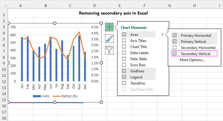
- Delete key. Click on the secondary axis you want to remove to select it, and then press the Delete key on your keyboard.
- Chart Elements menu. Alternatively, you can click the Chart Elements button, click the arrow next to Axis, and uncheck the Secondary axis box.
Either method will do the trick, and your chart will be back to a single axis.
In summary, adding, adjusting, and removing secondary axes in Excel charts is like giving your data a special ability. Whether your data is mixed, varies in size, or has secrets you want to uncover, a second axis can help you convey the information with clarity and precision. Thank you for reading and happy charting!
Practice workbook for download
Adding a second axis in Excel - examples (.xlsx file)
 by
by