If you were asked to name three key components of Microsoft Excel, what would they be? Most likely, spreadsheets to input data, formulas to perform calculations and charts to create graphical representations of various data types.
I believe, every Excel user knows what a chart is and how to create it. However, one graph type remains opaque to many - the Gantt chart. This short tutorial will explain the key features of the Gantt diagram, show how to make a simple Gantt chart in Excel, where to download advanced Gantt chart templates and how to use the online Project Management Gantt Chart creator.
What is a Gantt chart?
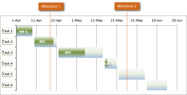
The Gantt chart bears a name of Henry Gantt, American mechanical engineer and management consultant who invented this chart as early as in 1910s. A Gantt diagram in Excel represents projects or tasks in the form of cascading horizontal bar charts. A Gantt chart illustrates the breakdown structure of the project by showing the start and finish dates as well as various relationships between project activities, and in this way helps you track the tasks against their scheduled time or predefined milestones.
How to make Gantt chart in Excel
Regrettably, Microsoft Excel does not have a built-in Gantt chart template as an option. However, you can quickly create a Gantt chart in Excel by using the bar graph functionality and a bit of formatting.
Please follow the below steps closely and you will make a simple Gantt chart in under 3 minutes. We will be using Excel 2010 for this Gantt chart example, but you can simulate Gantt diagrams in any version of Excel 2013 through Excel 365 in the same way.
1. Create a project table
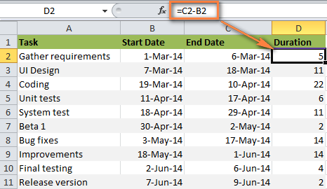
You start by entering your project's data in an Excel spreadsheet. List each task is a separate row and structure your project plan by including the Start date, End date and Duration, i.e. the number of days required to complete the tasks.
Tip. Only the Start date and Duration columns are necessary for creating an Excel Gantt chart. If you have Start Dates and End Dates, you can use one of these simple formulas to calculate Duration, whichever makes more sense for you:
Duration = End Date - Start Date
Duration = End date - Start date + 1
2. Make a standard Excel Bar chart based on Start date
You begin making your Gantt chart in Excel by setting up a usual Stacked Bar chart.
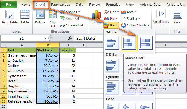
- Select a range of your Start Dates with the column header, it's B1:B11 in our case. Be sure to select only the cells with data, and not the entire column.
- Switch to the Insert tab > Charts group and click Bar.
- Under the 2-D Bar section, click Stacked Bar.
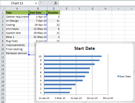
As a result, you will have the following Stacked bar added to your worksheet:
Note. Some other Gantt Chart tutorials you can find on the web recommend creating an empty bar chart first and then populating it with data as explained in the next step. But I think the above approach is better because Microsoft Excel will add one data series to the chart automatically, and in this way save you some time.
3. Add Duration data to the chart
Now you need to add one more series to your Excel Gantt chart-to-be.
- Right-click anywhere within the chart area and choose Select Data from the context menu.
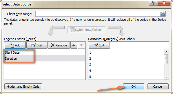
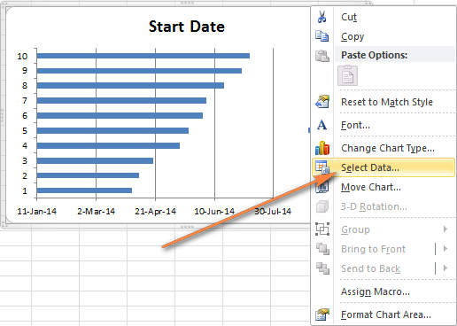 The Select Data Source window will open. As you can see in the screenshot below, Start Date is already added under Legend Entries (Series). And you need to add Duration there as well.
 - Click the Add button to select more data (Duration) you want to plot in the Gantt chart.
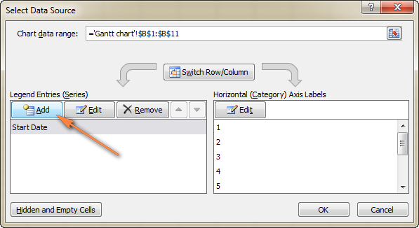
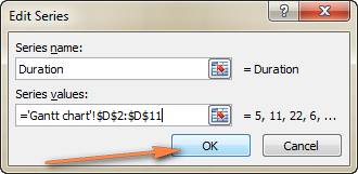
- The Edit Series window opens and you do the following:
- In the Series name field, type "Duration" or any other name of your choosing. Alternatively, you can place the mouse cursor into this field and click the column header in your spreadsheet, the clicked header will be added as the Series name for the Gantt chart.
- Click the range selection icon
 next to the Series Values field.

- A small Edit Series window will open. Select your project Duration data by clicking on the first Duration cell (D2 in our case) and dragging the mouse down to the last duration (D11). Make sure you have not mistakenly included the header or any empty cell.
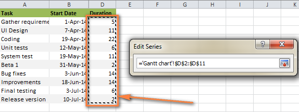
- Click the Collapse Dialog icon to exit this small window. This will bring you back to the previous Edit Series window with Series name and Series values filled in, where you click OK.
- Now you are back at the Select Data Source window with both Start Date and Duration added under Legend Entries (Series). Simply click OK for the Duration data to be added to your Excel chart.
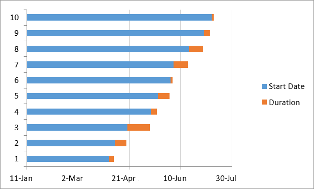
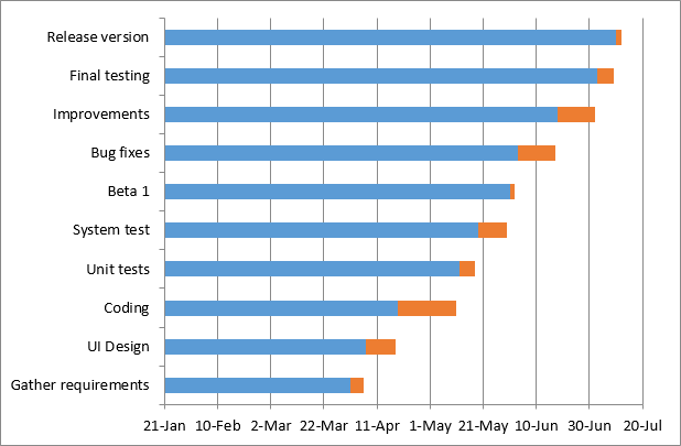
 The resulting bar chart should look similar to this:
4. Add task descriptions to the Gantt chart
Now you need to replace the days on the left side of the chart with the list of tasks.
- Right-click anywhere within the chart plot area (the area with blue and orange bars) and click Select Data to bring up the Select Data Source window again.
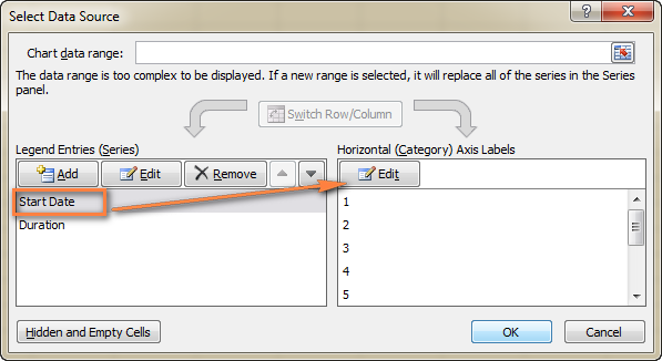
- Make sure the Start Date is selected on the left pane and click the Edit button on the right pane, under Horizontal (Category) Axis Labels.
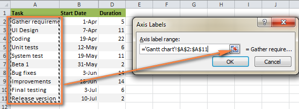
- A small Axis Label window opens and you select your tasks in the same fashion as you selected Durations in the previous step - click the range selection icon
 , then click on the first task in your table and drag the mouse down to the last task. Remember, the column header should not be included. When done, exit the window by clicking on the range selection icon again.
- Click OK twice to close the open windows.
- Remove the chart labels block by right-clicking it and selecting Delete from the context menu.
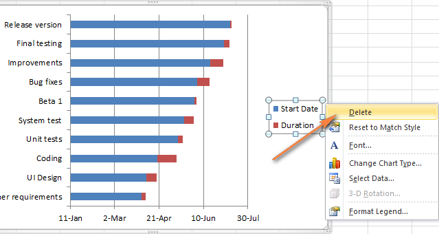 At this point your Gantt chart should have task descriptions on the left side and look something like this:
5. Transform the bar graph into the Excel Gantt chart
What you have now is still a stacked bar chart. You have to add the proper formatting to make it look more like a Gantt chart. Our goal is to remove the blue bars so that only the orange parts representing the project's tasks will be visible. In technical terms, we won't really delete the blue bars, but rather make them transparent and therefore invisible.
- Click on any blue bar in your Gantt chart to select them all, right-click and choose Format Data Series from the context menu.
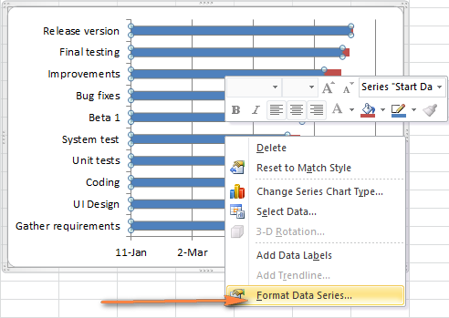
- The Format Data Series window will show up and you do the following:
- Switch to the Fill tab and select No Fill.
- Go to the Border Color tab and select No Line.

Note. You do not need to close the dialog because you will use it again in the next step.
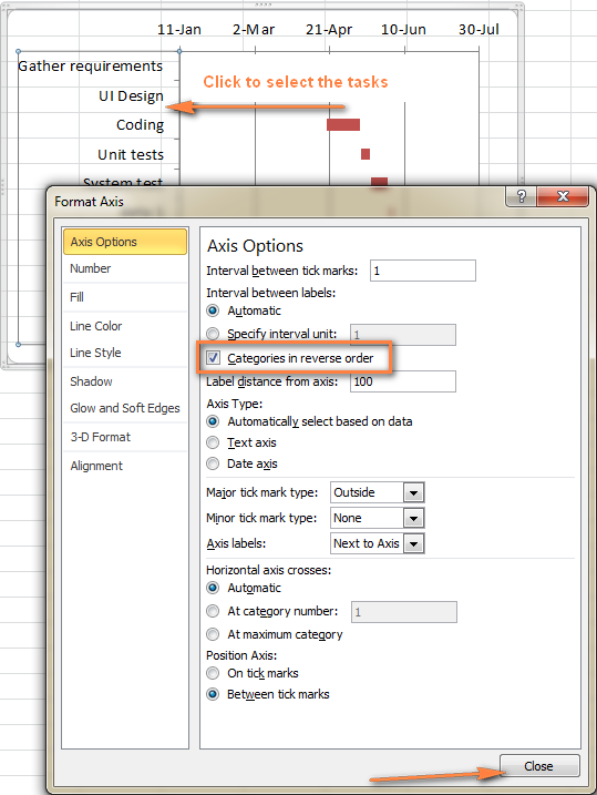
- As you have probably noticed, the tasks on your Excel Gantt chart are listed in reverse order. And now we are going to fix this.Click on the list of tasks in the left-hand part of your Gantt chart to select them. This will display the Format Axis dialog for you. Select the Categories in reverse order option under Axis Options and then click the Close button to save all the changes.
The results of the changes you have just made are:
- Your tasks are arranged in a proper order on a Gantt chart.
- Date markers are moved from the bottom to the top of the graph.
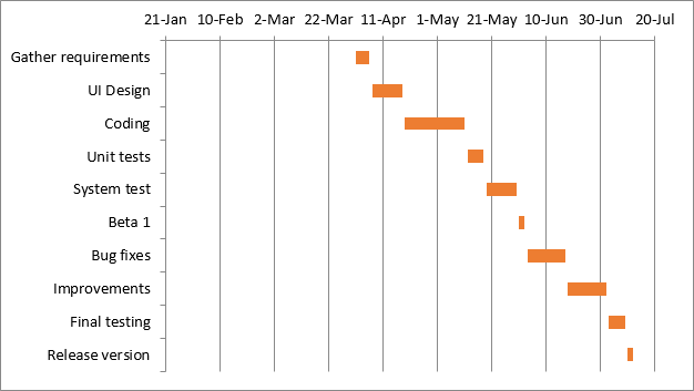
Your Excel chart is starting to look like a normal Gantt chart, isn't it? For example, my Gantt diagram looks like this now:
6. Improve the design of your Excel Gantt chart
Though your Excel Gantt chart is beginning to take shape, you can add a few more finishing touches to make it really stylish.
- Remove the empty space on the left side of the Gantt chart.As you remember, originally the starting date blue bars resided at the start of your Excel Gantt diagram. Now you can remove that blank white space to bring your tasks a little closer to the left vertical axis.
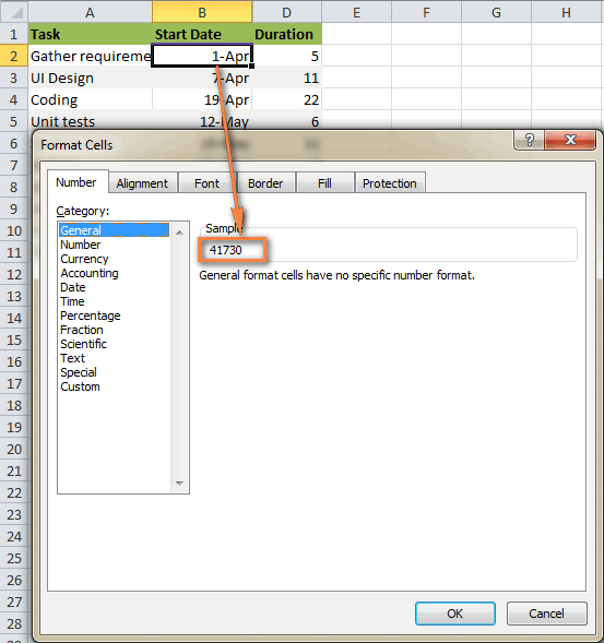
- Right-click on the first Start Date in your data table, select Format Cells > General. Write down the number that you see - this is a numeric representation of the date, in my case 41730. As you probably know, Excel stores dates as numbers based on the number of days since 1-Jan-1900. Click Cancel because you don't actually want to make any changes here.
- Click on any date above the task bars in your Gantt chart. One click will select all the dates, you right click them and choose Format Axis from the context menu.
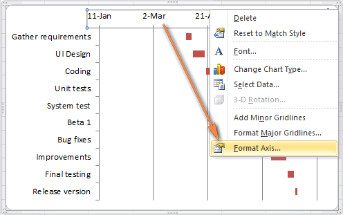
- Under Axis Options, change Minimum to Fixed and type the number you recorded in the previous step.
- Right-click on the first Start Date in your data table, select Format Cells > General. Write down the number that you see - this is a numeric representation of the date, in my case 41730. As you probably know, Excel stores dates as numbers based on the number of days since 1-Jan-1900. Click Cancel because you don't actually want to make any changes here.
- Adjust the number of dates on your Gantt chart. In the same Format Axis window that you used in the previous step, change Major unit and Minor unit to Fixed too, and then add the numbers you want for the date intervals. Typically, the shorter your project's timeframe is, the smaller numbers you use. For example, if you want to show every other date, enter 2 in the Major unit. You can see my settings in the screenshot below.
Note. In Excel 365, Excel 2021 - 2013, there are no Auto and Fixed radio buttons, so you simply type the number in the box.

Tip. You can play with different settings until you get the result that works best for you. Don't be afraid to do something wrong because you can always revert to the default settings by switching back to Auto in Excel 2010 and 2007, or click Reset in Excel 2013 and later.
- Remove excess white space between the bars. Compacting the task bars will make your Gantt graph look even better.
- Click any of the orange bars to get them all selected, right click and select Format Data Series.
- In the Format Data Series dialog, set Separated to 100% and Gap Width to 0% (or close to 0%).

And here is the result of our efforts - a simple but nice-looking Excel Gantt chart:
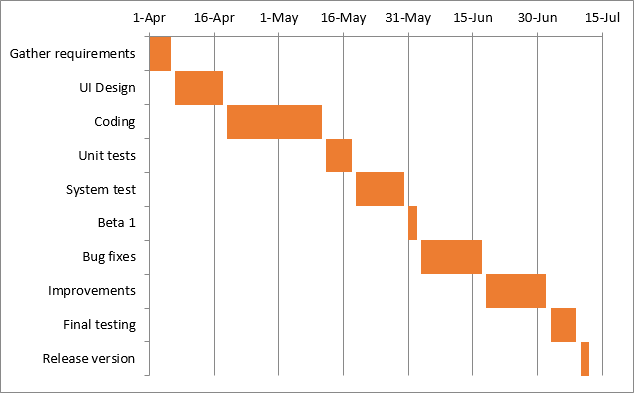
Remember, though your Excel chart simulates a Gantt diagram very closely, it still keeps the main features of a standard Excel chart:
- Your Excel Gantt chart will resize when you add or remove tasks.
- You can change a Start date or Duration, the chart will reflect the changes and adjust automatically.
- You can save your Excel Gantt chart as an image or convert to HTML and publish online.
Tips:
- You can design your Excel Gant chart in different ways by changing the fill color, border color, shadow and even applying the 3-D format. All these options are available in the Format Data Series window (right-click the bars in the chart area and select Format Data Series from the context menu).
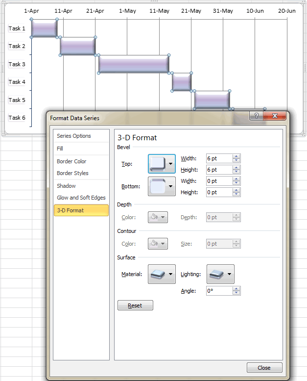
- When you have created an awesome design, it might be a good idea to save your Excel Gantt chart as a template for future use. To do this, click the chart, switch to the Design tab on the ribbon and click Save as Template.
Excel Gantt chart templates
As you see, it's not a big problem to build a simple Gantt chart in Excel. But what if you want a more sophisticated Gantt diagram with percent-complete shading for each task and a vertical Milestone or Checkpoint line? Of course, if you are one of those rare and mysterious creatures whom we respectively call "Excel gurus", you can try to make such a graph on your own, with the help of this article: Advanced Gantt Charts in Microsoft Excel.
However, a faster and more stress-free way would be using an Excel Gantt chart template. Below you will find a quick overview of several project management Gantt chart templates for different versions of Microsoft Excel.
Gantt chart template for Microsoft Excel
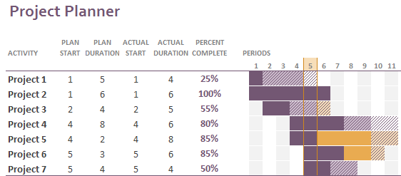
This Excel Gantt chart template, called Gantt Project Planner, is purposed to track your project by different activities such as Plan Start and Actual Start, Plan Duration and Actual Duration as well as Percent Complete.
In Excel 2013 - 2021, just go to File > New and type "Gantt" in the Search box. If you cannot find it there, you can download it from Microsoft's web-site - Gantt Project Planner template. This template requires no learning curve at all, simply click on it and it's ready for use.
Online Gantt chart template
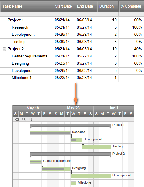
This is an Interactive Online Gantt Chart Creator from smartsheet.com. As well as the previous Gantt chart template, this one is fast and easy-to-use. They offer 30 days free trial, so you can sign with your Google account here and start making your first Excel Gantt diagram online straight away.
The process is very straightforward, you enter your project details in the left-hand table, and as you type a Gantt Chart is being built in the right-hand part of the screen.
Gantt chart template for Excel, Google Sheets and OpenOffice Calc
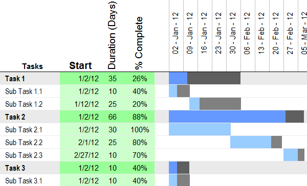
Gantt chart template from vertex42.com is a free Gantt chart template that works with Excel as well as OpenOffice Calc and Google Sheets. You work with this template in the same fashion as you do with any normal Excel spreadsheet. Simply enter the start date and duration for each task and define % in the Complete column. To change the range of dates displayed in the Gantt chart area, slide the scroll bar.
And finally, one more Gant chart Excel template for your consideration.
Project Manager Gantt Chart template
Project Manager Gantt Chart from professionalexcel.com is also a free project management Gantt chart template for Excel that can help track your tasks against their allocated time. You can choose either the standard weekly view or daily for short term projects.
Hopefully, at least one of the above-mentioned templates is suited for your needs. If not, you can create your own Gantt chart as demonstrated in the first part of this tutorial, and then save it as an Excel template.
Now that you are familiar with the main features of the Gantt diagram, you can explore it further and create your own sophisticated Gantt charts in Excel to amaze your boss and co-workers : )
Practice workbook for download
Gantt chart example (.xlsx file)
 by
by
82 comments
Hi Svetlana Cheusheva,
You are such a great teacher. Thanks
May God give you strength and bring this war to an end.
Chijioke
Thank you so much for your support Chijioke!
How can I make the planned duration a date and not a number?
Hello!
I recommend reading this guide: Convert date to text in Excel.
I hope my advice will help you solve your task.
Will be pleased if you reconsider the computation of the "duration" as used in your example above. it should be ((end date - start date) + 1).
Hi Maggie,
That sounds very reasonable, thank you! I've added your formula for the duration to the corresponding section.
Is there any way to create this GANT Chart based on the 8-hours day?
Just like we do in MS Project, we put duration (in hrs.) and Start date, and Finish date is calculated based on it.
Like If, duration is 8 it should add 2 days to Start date.
Did anyone answer your question? I'm still looking at hourly gannt charts stretched over 3 days.
You can do it by changing the cell format to Date/time so you can see the time.
Also change the duration cell format to custom [hh:mm] so you will see the accumulated hours between tasks.
Notice that the hours calculated are based on 24 hours a day.
Thank you very much, out of interest. Can you add a "completed" column which turns the duration cells to Green if you mark a "Yes" in the completed column?
Hi Sean Allen,
Sure. This can be easily done with conditional formatting. For the detailed information, please see Excel conditional formatting based on another cell value.
Dear Svetlana,
it is a very helpfull Article but i think that there is a mistake at the End Date calculation formula. The formula is :
End Date = Start Date + Duration - 1 Because End Date is included in Activity Duration.
I think that spreadsheet might need recalculation.
I'm sorry for the mistakes but English is not my first language
Thank you
Hi Nick,
Thank you for your comment! In fact, End Dates are not needed for building a Gantt chart. I just explained how to calculate Duration if someone has Start Dates and End Dates.
I think you are right, I focused to the tree and I've lost the forest.
Good work but I observed that the start date on the Gantt chart doesn't tally with data.
Hi Sammies,
You can change the start date as explained in Step 6. Improve the design of your Excel Gantt chart.
I got all the way through the tutorial with no issue until Step 6. What I see now is extra dates to the left of my actual start dates for the project. In other words, I have dates in the top axis that I cannot remove and start before the project actually starts. Any help is appreciated!!
Hi Alayna,
Please see Step 6. Improve the design of your Excel Gantt chart. It explains how to remove extra dates in the left part.
Hello everyone,
Why this chart is starting from Jan 11? Here also the earliest activity start date is Mar 1, 2014. I followed the same steps and my first start date is Nov 27 but on my chart's date axis all activities are starting from Nov 11.
Please explain and tell me what I am doing wrong.
Thanks and Regards
Vabz
Hello Vabz,
Blue bars starting from Jan 11 were only an intermediate result. On step 5, we make them disappear so that only orange bars are visible (the earliest activity start date is Apr 1). To improve your Gantt chart further, please follow the instructions from step 6 that explain how to remove the empty space on the left side of the chart. The result is shown in the screenshot at the end of step 6 (the date axis beginning with Apr 1).
How do you name your chart inside the GANTT chart?
hi Glenn,
Are you asking about how to add a title to chart? If so, the detailed instructions can be found here: How to add title to Excel chart
I'm not sure if someone else has already asked this, but does anyone know how to write the start/end dates properly? Whenever I type down 31-Jan-17 it automatically changes to 31/01/17.how do I stop this?
Hello Tannglynn,
When you type a date in a cell, Excel automatically converts it to the default date format. To display dates in your own format, do the following:
- Select the cells where you want to enter (or have entered) the dates and press Ctrl+1 to open the Format Cells dialog.
- On the Number tab, and select Date in the Category list.
- Under Type, pick a desired date format, and click OK.
For more information, please see How to change date format in Excel.
Anyone know how to make my tasks name appear in full within the gantt chart?
Try this detailed tutorial, it's super easy!
Not sure if this is what you mean, but to make the column bigger to fit the words you can slide your mouse to the lines separating the rows. Once you do that your on-screen mouse will change to the four arrows and you can pull your column outwards by moving the mouse or your finger if you're on a touch screen device
Alternatively,having seen such kind of four arrows as instructed,just left double click the mouse, then the column will be adjusted automatically to fit the size of the information to be accommodated.
Repeat of a question asked several times above but not answered--is there a way I can make this work for repeated tasks? The above steps work well for linear tasks, but let's say I need 'documentation' to appear every 60 days in my chart, ie I have more than one start and end dates for a single line item. How do I reflect that?
I am wondering about that too but looks like Svetlana is choosing to not respond to that.
Sorry, guys, for not responding earlier. I've been switched to other projects lately and did not monitor comments to my older posts.
A quick search on the web got me these articles, hope they will prove helpful:
Gantt chart for repeated tasks
Easier Gantt chart for repeated tasks
How to make a Gantt chart for recurring tasks
Hi there,
My current gantt is entered in days. How can I change that to reflect weeks?
Please respond urgently
Thank you
try exiting in weeks. so it will reflect the weeks that you have wasted.
I am trying to create a Gantt Chart or another chart that will display multiple items across the same line over about a five year period. The months need to be able to be expanded to display the days of the month as well so the start and end dates of each data point can be displayed when needed. is there a template already made that will capture data in this manner?
Thank you,
James
Hi James,
I think going from a five year view to a day view will surpass excels capabilities. I myself used to make gantts in excel but I said enough. I came to this comment section because I used to do this.
I want to understand more about how people are using gantts and why, to build an easier way to do them. No selling. Just want to learn more to build the right thing.
Are you up for a 20 min chat?
Adrian.
Hi - I can't see anything saying 'fixed' in format axis -is it the version im using? its excel 2016 - Thanks
Hi Lottie,
In Excel 2013 and Excel 2016, are no Auto and Fixed radio buttons, so you simply type the number in the box.
Re the above comment- sorry ignore the gaps example its selecting fixed axis options that is the problem for me in 2016 :)
Hi Andrew,
In Excel 2013 and Excel 2016, are no Auto and Fixed radio buttons, and you simply type the number in the box to make a certain unit fixed.
I've added this note to the tutorial, thanks for pointing it out!
Can you please help? I have been trying for hours to make the tasks names closer together, as there is a huge gap, in between. Have tried in Format Data Series but there does not seem to be an option there that will allow me to edit (it is greyed out). I have Excel 2013, so options shown above aren't necessarily the same.
it's all good, just figured it out.
when i tried to select the data, it only shows 'sheet1'!.....whereas in your sample if I click select data it will show 'Ghantt'!. why is so?
Hi Pema,
'sheet1'! is just the name of the sheet where you are selecting data. In my sample workbook, I named the sheet "Gantt chart" and therefore you see this name.
I tried setting up the date axis but couldn't select the "fixed" option under part 6.2. I'm using Excel for Mac.
Hi Gregg,
In Excel for Mac there are no Auto and Fixed radio buttons, so you simply type the number in the box.