The tutorial shows how to identify, highlight and label a specific data point in a scatter chart as well as how to define its position on the x and y axes.
Last week we looked at how to make a scatter plot in Excel. Today, we will be working with individual data points. In situations when there are many points in a scatter graph, it could be a real challenge to spot a particular one. Professional data analysts often use third-party add-ins for this, but there is a quick and easy technique to identify the position of any data point by means of Excel. There are a few parts to it:
The source data
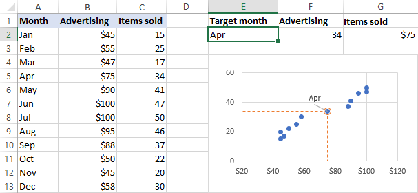
Supposing, you have two columns of related numeric data, say monthly advertising costs and sales, and you have already created a scatter plot that shows the correlation between these data:
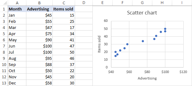
Now, you want to be able to quickly find the data point for a particular month. If we had fewer points, we could simply label each point by name. But our scatter graph has quite a lot of points and the labels would only clutter it. So, we need to figure out a way to find, highlight and, optionally, label only a specific data point.
Extract x and y values for the data point
As you know, in a scatter plot, the correlated variables are combined into a single data point. That means we need to get the x (Advertising) and y (Items sold) values for the data point of interest. And here's how you can extract them:
- Enter the point's text label in a separate cell. In our case, let it be the month of May in cell E2. It is important that you enter the label exactly as it appears in your source table.
- In F2, insert the following VLOOKUP formula to extract the number of the sold items for the target month:
=VLOOKUP($E$2,$A$2:$C$13,2,FALSE) - In G2, pull the advertising cost for the target month by using this formula:
=VLOOKUP($E$2,$A$2:$C$13,3,FALSE)At this point, your data should look similar to this:

Add a new data series for the data point
With the source data ready, let's create a data point spotter. For this, we will have to add a new data series to our Excel scatter chart:
- Right-click any axis in your chart and click Select Data….
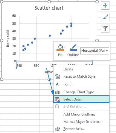
- In the Select Data Source dialogue box, click the Add button.

- In the Edit Series window, do the following:
- Enter a meaningful name in the Series name box, e.g. Target Month.
- As the Series X value, select the independent variable for your data point. In this example, it's F2 (Advertising).
- As the Series Y value, select the dependent In our case, it's G2 (Items Sold).
- When finished, click OK.

As the result, a data point in a different color (orange in our case) will appear among the existing data points, and that is the point you are looking for:
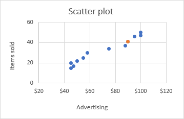
Of course, since the chart series update automatically, the highlighted point will change once you type a different name in the Target Month cell (E2).
Customize the target data point
There are a whole lot of customizations that you can make to the highlighted data point. I will share just a couple of my favorite tips and let you play with other formatting options on your own.
Change the appearance of the data point
For starters, let's experiment with colors. Select that highlighted data point, right click it and select Format Data Series… in the context menu. When doing so, please make sure that only a single data point is selected:
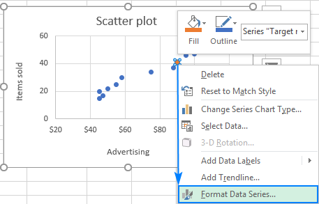
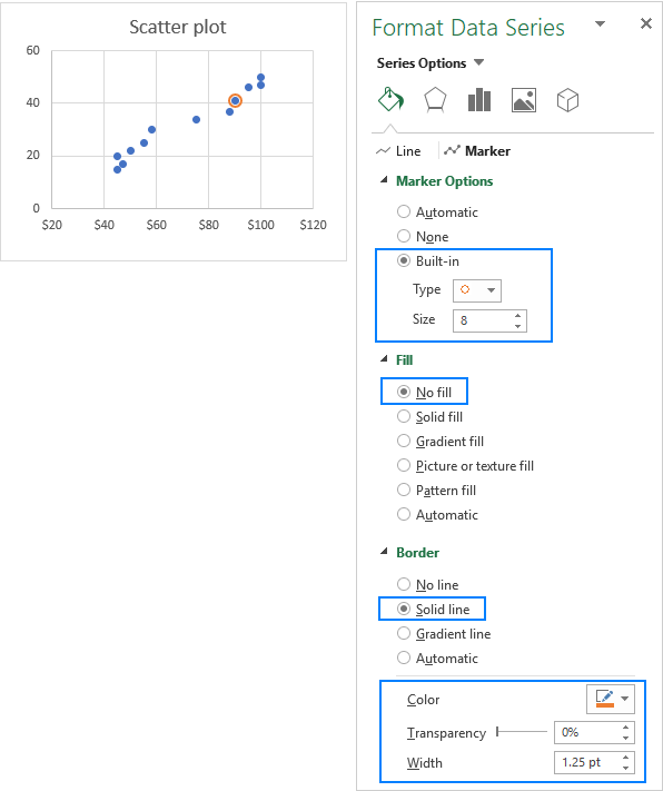
On the Format Data Series pane, go to Fill & Line > Marker and choose any color you want for the marker Fill and Border. For example:

In some situations, using a different color for the target data point may not be appropriate, so you can shade it with the same color as the rest of the points, and then make it stand out by applying some other maker options. For example, these ones:
Add the data point label
To let your users know which exactly data point is highlighted in your scatter chart, you can add a label to it. Here's how:
- Click on the highlighted data point to select it.
- Click the Chart Elements button.
- Select the Data Labels box and choose where to position the label.
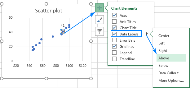
- By default, Excel shows one numeric value for the label, y value in our case. To display both x and y values, right-click the label, click Format Data Labels…, select the X Value and Y value boxes, and set the Separator of your choosing:

Label the data point by name
In addition to or instead of the x and y values, you can show the month name on the label. To do this, select the Value From Cell check box on the Format Data Labels pane, click the Select Range… button, and choose the appropriate cell in your worksheet, E2 in our case:
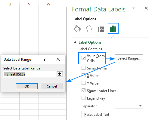
If you want to show only the name of the month on the label, clear the X Value and Y Value boxes.
As the result, you will get the following scatter plot with the data point highlighted and labeled by name:

Define the position of the data point on x and y axes
For better readability, you can mark the position of the data point important to you on the x and y axes. This is what you need to do:
- Select the target data point in a chart.
- Click the Chart Elements button > Error Bars > Percentage.

- Right-click on the horizontal error bar and choose Format Error Bars… from the pop-up menu.

- On the Format Error Bars pane, go to the Error Bar Options tab, and change Direction to Minus and Percentage to 100:

- Click the vertical error bar and do the same customization.
As the result, the horizontal and vertical lines will extend from the highlighted point to the y and x axes, respectively:

- Finally, you can change the color and style of the error bars so that they better fit the colors of your chart. For this, switch to the Fill & Line tab of the Format Error Bars pane and choose the desired Color and Dash type for the currently selected error bar (vertical or horizontal). Then do the same for the other error bar:

And here comes the final version of our scatter graph with the target data point highlighted, labeled and positioned on the axes:
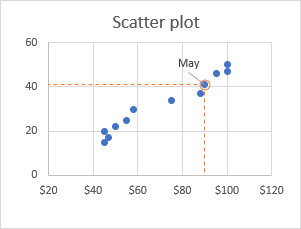
The best thing about it that you have to perform these customizations only one. Due to the dynamic nature of Excel charts, the highlighted point will change automatically as soon as you input another value in the target cell (E2 in our example):
Show a position of average or benchmark point
The same technique can also be used to highlight the average, benchmark, smallest (minimum) or highest (maximum) point on a scatter diagram.
For example, to highlight the average point, you calculate the average of x and y values by using the AVERAGE function, and then add these values as a new data series, exactly as we did for the target month. As the result, you will have a scatter plot with the average point labeled and highlighted:

That's how you can spot and highlight a certain data point on a scatter diagram. To have a closer look at our examples, you are welcome to download our sample workbook below. I thank you for reading and hope to see you on our blog next week.
Practice workbook
Excel Scatter Plot - examples (.xlsx file)
 by
by
4 comments
Good afternoon,
Im wondering if there is any way to label the peaks of Y values. like in chromatography. My chart has 3000 points so I need to highlight only some of the highest values. Thank you in advance and have a great day
Yes, I also would like to know this.
And also whether you can have point series labels appear only when you hover over the point.
I created a chart in excel with multiple lines. I have added the legend. I would like to know how I can add the latest data point of each series to its legend, i.e. in the legend box, not to the lines of the chart. Can you help?
Hi Floris,
You can change the legend labels in this way:
1. Right-click the legend, and click 'Select Data…'
2. In the 'Select Data Source' box, click on the legend entry that you want to change, and then click the Edit button.
3. The 'Edit Series dialog' window will show up. The 'Series name' box - it's where Excel takes the label for the selected legend entry. You can either type the desired text in that box, e.g. ="Apples 10", or you can add a reference to the cell that contains the latest data point (click in the box, and then click the cell). If you add a cell reference, the legend label will updated automatically as soon as you change the corresponding value in the source table.
4. Click OK twice to close both dialog windows.